Contour plots
Maps - Contour plots with labels
So, you have always wondered how on Earth one can make a real map with gnuplot. Well, there is a simple and a not-so-simple way to this. First, let us see the simple way. Since it is simple, this method won't have one of the features, isoline labelling, that the second one has. As we go along, the map will become more and more complicated, but I hope that I set the right pace, and it will be easy to follow.
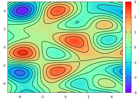
A map is nothing but a colour-coded 3D plot, with the isolines attached to it. We will produce a simple map using the function
sin(1.3*x)*cos(0.9*y)+cos(.8*x)*sin(1.9*y)+cos(y*.2*x)
I don't think that this function has any particular meaning, but it looks quite all right, at least, as far as maps and isolines are concerned. If you have a matrix to plot, you can replace this function with that file. In principle, we could plot both the colour-coded map and the isolines from gnuplot, but we will have much greater flexibility, if we first direct the plots to a file, and then call the data from those files. One of the advantages of doing this is that in this way, we can make sure that the various plots have the same size. This requires a small overhead in terms of scripting, namely, we have got to issue the command
set table 'something.dat'
splot something
unset table
While this might appear superfluous, there are good reasons to do this. If we plot our function through the file something.dat, then we can use the with image modifier of the plot command, and this means that the plot will be of the same size as would a normal 2D plot. Otherwise, if we use
set pm3d map
splot something with pm3d
the plot will actually be a bit smaller. The reason behind this is that in a 3D plot, we have to have some space for the z axis, and even if we drop it in the map view, the space-holder for the z axis is still there, therefore, gnuplot makes the whole plot a bit smaller. If, however, we plot the map through a file, we can use plot, in splot's stead, therefore, the z axis will not appear anywhere in the processing of the plot.
After this interlude, let us see our first version of the map!
reset
f(x,y)=sin(1.3*x)*cos(.9*y)+cos(.8*x)*sin(1.9*y)+cos(y*.2*x)
set xrange [-5:5]
set yrange [-5:5]
set isosample 250, 250
set table 'test.dat'
splot f(x,y)
unset table

set contour base
set cntrparam level incremental -3, 0.5, 3
unset surface
set table 'cont.dat'
splot f(x,y)
unset table

reset
set xrange [-5:5]
set yrange [-5:5]
unset key
set palette rgbformulae 33,13,10
p 'test.dat' with image, 'cont.dat' w l lt -1 lw 1.5
In the first couple of lines, we plot the actual function into a file, called test.dat. There will be some 25000 data points in this file, for there are 100 samples (default), and 250 isosamples. Having written these points into a file, we plot the contour. We just happen to know that the value of f(x,y) is between -3 and 3, so we set the contour levels at -3, -2.5...2.5, 3. When we are done with all this, we simply reset our plot, set the x and yrange, specify the palette that we want to use with the colouring, and call the plot command. For the actual data points, we use the with image modifier, while for the contours, we increase the linewidth to 1.5, instead of using the default value of 1. We, thus, have just produced the following image.
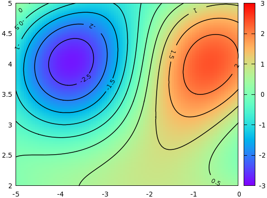
Now, this was sort of standard, but the question inevitably comes up, whether we could do something more with this. When one has contour lines, one wants to label them, I presume. Petr Mikulik has a gawk script that will do this, in particular, it will place the appropriate labels next to the contour lines. I will discuss another approach here. The main difference with Petr Mikulik's method is that here we will put the labels on the contour lines, with some white space, of course.
First, it is quite instructive to look at the file containing the contour lines. In order not to cobble the plot, we will restrict it to the range [-5:0] (x) and [2:5], but it is really just for the sake of simplicity. With this modification, the file should read as
#Surface 0 of 1 surfaces
\n
# Contour 0, label:        2
-0.482969  3.59036  2
-0.505051  3.58024  2
-0.509852  3.57831  2
-0.539895  3.56627  2
-0.555556  3.55994  2
-0.572136  3.55422  2
...

# Contour 1, label:      1.5
-1.11111  4.57693  1.5
-1.10874  4.57831  1.5
-1.0877  4.59036  1.5
-1.06617  4.60241  1.5
-1.06061  4.60546  1.5
-1.04273  4.61446  1.5
...
What this means is that the 0th contour line is drawn at z=2, and then the (x,y,z) values are listed. Of course, since we know that this particular line is at z=2, the last coordinate doesn't play any role, but it is listed all the same. When we plot this file, consecutive (x,y) points will be connected by a straight line segment. The next contour is at 1.5 etc. It might happen that one contour line is made up of several blocks, both for technical, and fundamental reasons. The technical reason is gnuplot's inner procedure of computing the an isoline, while the fundamental is simply that there might be several disconnected regions with the same isolevel. Anyway, if there are several blocks, they are separated by a blank line within the same contour.
In order to create the labels and the white spaces for them, we will use the following short script:
#!/bin/bash
gawk -v d=$2 -v w=$3 -v os=$4 'function abs(x) { return (x>=0?x:-x) }
    {
            if($0~/# Contour/) nr=0
            if(nr==int(os+w/2) && d==0) {i++; a[i]=$1; b[i]=$2; c[i]=$3;}
            if(abs(nr-os-w/2)>w/2 && d==1) print $0
            nr++
    }
    END {   if(d==0) {
                    for(j=1;j<=i;j++)
                    printf "set label %d \"g\" at %g, %g centre front\n", j, c[j], a[j], b[j]
            }
    }' $1
This script operates on the data file of contour lines that we had before, and simply takes out a couple of points of the contours, while keeping one of the coordinates as the position of the labels. You can change the length of the white space by setting the w (width) argument, while the position of the white space can be modified by changing the os (offset) argument. The first argument, d (decision), determines what we want to do with the script: make the labels, or tweak the input file. Now, we can call the script from our gnuplot script as follows:
reset
set xrange [-5:0]
set yrange [2:5]
set isosample 150, 150
set table 'test.dat'
splot sin(1.3*x)*cos(.9*y)+cos(.8*x)*sin(1.9*y)+cos(y*.2*x)
unset table
set cont base
set cntrparam level incremental -3, 0.5, 3
unset surf
set table 'cont.dat'
splot sin(1.3*x)*cos(0.9*y)+cos(.8*x)*sin(1.9*y)+cos(y*.2*x)
unset table
reset
set xrange [-5:0]
set yrange [2:5]
unset key
set palette rgbformulae 33,13,10
l '<./cont.sh cont.dat 0 15 0'
p 'test.dat' w ima, '<./cont.sh cont.dat 1 15 0' w l lt -1 lw 1.5
Running the script results in the following figure

There are two more twists that we could add to the figures above. One is that the labels can be rotated in such a way that they are parallel to the curves. This we can easily achieve by adding two more lines to our script above: we take the first and last dropped coordinate, and calculate the angle that that line segment would make with the horizontal. Using this angle, we rotate the labels accordingly. With this modification, the script now becomes
#!/bin/bash

gawk -v d=$2 -v w=$3 -v os=$4 'function abs(x) { return (x>=0?x:-x) }
    {
            if($0~/# Contour/) nr=0
            if(nr==int(os+w/2) && d==0) {a[i]=$1; b[i]=$2; c[i]=$3;}
            if(nr==int(os+w/2)-1 && d==0) {i++; x = $1; y = $2;}
            if(nr==int(os+w/2)+1 && d==0) r[i]= 180.0*atan2(y-$2, x-$1)/3.14
            if(abs(nr-os-w/2)>w/2 && d==1) print $0
            nr++
    }
    END {   if(d==0) {
                    for(j=1;j<=i;j++)
                    printf "set label %d \"%g\" at %g, %g centre front rotate by %d\n", j, c[j], a[j], b[j], r[j]
            }
    }' $1
and the resulting graph is shown here:
Note that the only difference between this and the previous script is the following two lines
if(nr==int(os+w/2)-1 && d==0) {i++; x = $1; y = $2;}
if(nr==int(os+w/2)+1 && d==0) r[i]= 180.0*atan2(y-$2, x-$1)/3.14
where we calculate the appropriate angles.
The second twist is that it might make interpretation of the figure easier, if the contours are coloured, as are the corresponding labels. We can use the script above with some small modification. The key is to use the index modifier. Recall that the contours are rendered in blocks, and with the help of the index keyword, we can specify which block we want to plot. We, therefore, modify our script as follows:
#!/bin/bash

gawk -v d=$2 -v w=$3 -v os=$4 'function abs(x) { return (x>=0?x:-x) }
   {
           if($0~/# Contour/) nr=0
           if(nr==int(os+w/2) && (d\%2)==0) {a[i]=$1; b[i]=$2; c[i]=$3;}
           if(nr==int(os+w/2)-1 && (d\%2)==0) {i++; x = $1; y = $2;}
           if(nr==int(os+w/2)+1 && (d\%2)==0) r[i]= 180.0*atan2(y-$2, x-$1)
           if(abs(nr-os-w/2)>w/2 && (d\%2)==1) print $0
           nr++
   }
   END {   if(d==0) {
                   for(j=1;j<=i;j++)
                   printf "set label %d \"%g\" at %g, %g centre front rotate by %d tc lt %d \n", j, c[j], a[j], b[j], r[j], j
           }
           if(d==2) {
                   printf "plot \"test.dat\" w ima, \"cont.plt\" index 0 w l lt 1,\\\n"
                   for(j=2;j<i;j++) printf "\"\" index %d w l lt %d,\\\n", j-1, j
                   printf "\"\" index %d w l lt %d\n", i-1, i
           }
   }' $1
Calling the script produces the following graph:
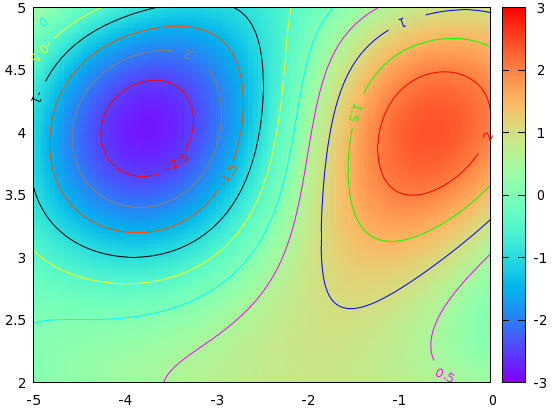
Note that we had to call plot through a new temporary file, cont.plt, which should be produced by redirecting the output of
cont5.sh 2 15 0 > cont.plt
by Zoltán Vörös © 2009