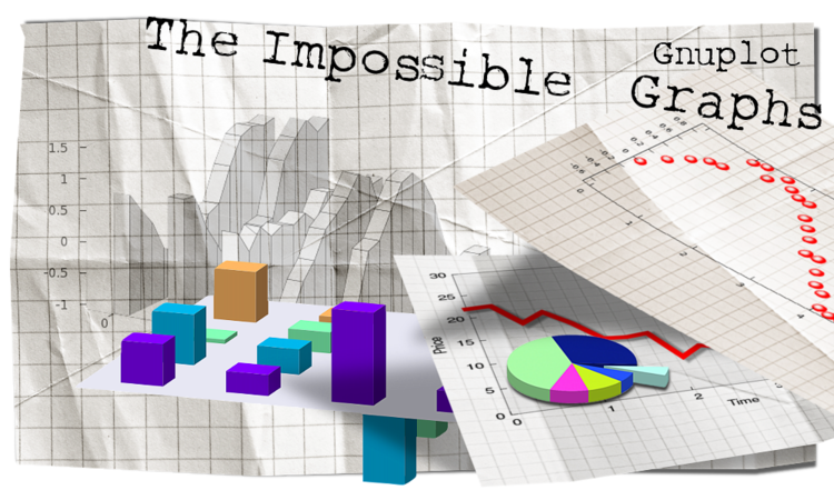
Impossible gnuplot graphs
Introduction
I have been using gnuplot for some 10 years by now, and during this time, I have become quite fond of it. I liked the idea that one needn't see the data file in order to plot it, and that functions can very easily be plotted. In fact, sometimes too easily. What I mean by this is that many people rejoice in this fact, and they do not make the effort to turn the figure into something appealing. It is trivial to plot sin(x), but then the graph must be "dressed" up, proper limits, labels, ticmarks, colour etc. given, and it takes some time to set all these. But these can be automated, so to speak, and usually, the lookout of a figure must be set up only once, and those settings can be re-used many times. At one point, I had to produce literally hundreds of figures per day, and I could do it with one key-stroke. I mean, all figures with a single key-stroke. So, the tremendous convenience of scriptability should not be underestimated.
However, there are obvious problem with this whole concept. First, due to the initial difficulty of setting up a figure properly, most figures generated by gnuplot look the same, and follow the same simple scheme. And second, some plot types cannot be generated at all. Well, at least, not in the common sense. Have you ever found pie charts made by gnuplot? Perhaps a 3D pie chart? A 3D exploded pie chart? Or 3D bar graphs? Probably not too many. This latter one was a graph that I very badly wanted, but did not find.
But we can change all this, and this is what I would like to set out to do. In these pages, I would like to show that all the above-mentioned problems can be abridged. We will see that with a couple of easy modifications, graph can be turned into something unique. We will see that the "impossible" types of plots can also be produced, in fact, they can be produced rather easily, once we know what we want and need to do. As a bonus for the hard work, we will have ultimate control over every aspect of the plot.
This document is divided into three sections. The first one contains the trivial tricks, those that one can easily find in the manual, and yet, change the figure tremendously. The second section contains those tricks that are a bit more complicated, but still do not require any "outside" job. Finally, I will discuss the more advanced tricks, e.g., how we can produce a 3D pie chart, or a bargraph. These usually rely on an external script that I implemented in gawk. I have tried to make the scripts quite general, and it should be easy to change them in a way that suits your needs. However, I had to sacrifice some generality in the sake of readability, i.e., it might be necessary at times to modify the script. I am a Linux fan, and this is why in some of the gnuplot scripts, the actual data processing is done via a pipe. As I understand, it is not going to work under Windows, but the gawk scripts should still be workable with one extra step. In this regard, I would really appreciate the comments and insights of a Windows-savvier person. I would also like to point out that most of these scripts can be implemented entirely in gnuplot. For portability's sake, I will give a gnuplot equivalent of the scripts mentioned above. In some cases, the implementation of a script is cleaner, or at least, more readable in gnuplot, than in (g)awk. Everything included here should work in gnuplot 4.2. I have not tried previous versions, so if you want to use these scripts, you might be on your own.
There is a "saying", by which linux is not free, you pay for it by helping others. By the same token, nor is gnuplot free. I have been using it for some time now, without paying anything for it. Perhaps, this is my turn now, and I would like to think that everyone will find something useful in these pages. I would also like to ask for your feedback, let it be criticism, wishes, or just pointing out typos. If you would leave feedback, please, do that on my blog! At least, for the time being.
Links of interest
There are several places where you can find valuable information on gnuplot, and on how to use it. The first one is gnuplot's central site, of course, at Gnuplot central. You can find a lot of scipts there, and that is where you should first look, if something is unclear.
Then we should not forget about the gnuplot discussion group, where I found quite a few very interesting ideas, and where I also figured out what people wanted to know, and what they had problems with.
The not so frequently asked questions makes a very useful reading.
I haven't read the book, but I have seen lauding reviews of Philipp Janert's Gnuplot in action. Looking at the table of contents of the book, I would say, that complements the present material in the sense that Philipp put more emphasis on how to make the figures more informative, while I deal with how to make the figure look better.
And finally, my blog, where all this started in the spring of 2009. This document is based on that blog, but with a better structure, and the appropriate cross-references. I have also the wisdom of hindsight now, and I have learnt what was not so clear or even erroneous on that blog. In this regard, I do think that this material is more mature. On the other hand, I am still going to use the blog as a sand-box, and it is more, than probably that new ideas will first be presented there.
Useful tiny scripts
Converting gnuplot scipts
I think it should go without saying that all plotting commands should be in a file, so that you can re-use it later on. In fact, if one does this, one hasn't even got to enter gnuplot, everything can be done via the command line. The following two scipts take a gnuplot script, and turn it into an EPS or PNG file. Note that these will produce nothing, if your gnuplot script contains a reset somewhere at the beginning. This can be alleviated by removing the reset. After all, when calling gnuplot in this way, there is nothing to be re-set, for gnuplot starts with a carte blanche.
#!/bin/bash
OUT=`echo $1 | cut -d"." -f1`
echo "set output '$OUT.eps';
set terminal postscript enhanced eps solid colour \"Helvetica\" 22; load '$1'" gnuplot
#!/bin/bash
OUT=`echo $1 | cut -d"." -f1`
echo "set output '$OUT.png'; set terminal png medium; load '$1'" | gnuplot
Converting an EPS file into a PDF
I would also like to point out that for vector graphics, EPS might not be the best option. You can reduce the size of an EPS file by a factor of 2-10, if you convert it into PDF using ghostview, and you would need pdf figures, if you are using pdflatex. The only thing to watch out for is that the figure should be cropped around the bounding box. The following script takes an EPS file produced by gnuplot, and turns it into a PDF. (And also checks for the existence of the PDF, so you can't overwrite it by accident.)
#!/bin/bash
if [ $# -lt 1 ]
then
        echo "Usage: eps2pdf <input file> [-y]"
        exit 1
fi
if [ ! -e "$1" ] && [ ! -e "$1".eps ]
then
        echo "File "$1"/"$1".eps doesn't exist."
        exit 1
fi
if [ -e "$1" ]
then
        INFILE="$1"
        OUTFILE=`echo $1 | sed s/.eps//`
else
        INFILE="$1".eps
        OUTFILE="$1"
fi
if [ "$2" == "-y" ] || [ ! -e "$OUTFILE".pdf ]
then
        ps2pdf -dEPSCrop "$INFILE" "$OUTFILE".pdf
        exit 1
fi
if [ -e "$OUTFILE".pdf ]
then
        echo -n "Overwrite file "$OUTFILE".pdf? "
        read decision
fi
if [ "$decision" == "y" ] || [ "$decision" == "Y" ]
then
        ps2pdf -dEPSCrop "$INFILE" "$OUTFILE".pdf
else
        exit 1
fi
Of course, gnuplot has a PDF terminal, but I have had mixed experiences with that, while the EPS file always looks as it should. I believe, the postscript terminal is probably the most mature of all the available terminals. (And that is the one that would be most used in publications.)
A note on EPS and PDF figures
In many cases, most notably, on multiplots, and 3D plots, the bounding box of the eps figure is not exactly what you would want. (And then, similar comments apply to the size of pdf file, if produced by converting the eps file.) This is especially a problem, if you include the files somewhere: latex and the like will allocate space according to the bounding box, and if that is much bigger, than the actual figure, you are going to have a lot of quite distracting white space in your document. However, this can easily be fixed. The first several lines of the eps file are similar to these
%!PS-Adobe-2.0 EPSF-2.0
%%Title: derint.eps
%%Creator: gnuplot 4.2 patchlevel 4
%%CreationDate: Tue Aug 25 20:30:03 2009
%%DocumentFonts: (atend)
%%BoundingBox: 50 50 410 302
%%EndComments
%%BeginProlog
The important part is the line with %BoundingBox, where the x and y coordinates of the lower left and upper right corner are listed. By changing these numbers accordingly, you can easily modify the effective size of your figure. I have applied this trick in this document quite a few times.
by Zoltán Vörös © 2009