Ribbon charts
Ribbon charts
While I am not a vary big fan of this kind of chart, I must admit that on occasion, it might lend a refreshing new look to a graph. Besides, we can use it for something else, but more on that later. If you are very impatient, you can check out the details in ...
So, we will set to make this graph
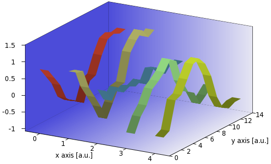
from a data file similar to this
0.857354 0.943516 0.546751 -0.588053 -0.548767
0.551386 0.896607 0.163013 -0.166411 -0.442178
0.243002 0.310189 0.465029 0.0790944 0.378762
-0.24 -0.0625021 0.226812 0.48102 0.451281
-0.422674 -0.444781 0.314025 0.626378 0.822247
-0.513352 -0.893642 0.220384 0.800136 1.1908
-0.660823 -0.513169 0.316238 1.08866 1.25814
-0.0962106 -0.130051 0.0965893 0.944557 1.01623
-0.0152513 -0.0945605 0.468029 0.240179 0.556154
0.489453 0.726084 0.398192 -0.162081 -0.167408
0.876023 0.997108 0.139124 -0.281058 -0.581462
0.945061 1.19238 0.359603 -0.706723 -0.687105
0.860648 0.907059 0.217838 -0.540168 -0.592025
0.901743 1.02898 0.242619 -0.337589 -0.584658
which we will call ribbon.dat. We will need this data file in subsequent plots. There is an easy way to make this graph, and this solution requires an external script. In the next part, I will show a solution, if a bit convoluted, entirely in gnuplot, so that even those of you, who do not fancy a gawk one-liner, can make a similar figure.
Ribbons with a gawk one-liner
The basic idea is to take the columns of ribbon.dat one by one, and turn them into a surface plot, whose derivative in the x direction is zero, while it takes the successive values of the column along the y axis. The gawk one-liner that does this transformation for us is given here
gawk -v c=1 '{printf "0 %d %g\n1 %d %g\n\n", NR-1, $c, NR-1, $c}' ribbon.dat
which we can put in a file, ribbon.sh as follows
#!/bin/bash
gawk -v c=$2 '{printf "0 %d %g\n1 %d %g\n\n", NR-1, $c, NR-1, $c}' $1
The script takes the column designated by the value of 'c', and instead of listing the members, we print out six times the length of the column numbers, of the form
0 0 0.857354
1 0 0.857354

0 1 0.551386
1 1 0.551386

0 2 0.243002
1 2 0.243002

0 3 -0.24
1 3 -0.24

0 4 -0.422674
1 4 -0.422674
...
If you look carefully, you will notice that this is nothing but the first four elements in the first column. In this list, the first column is the 'x' value, the second column is the 'y' value, and the third is the 'z' value. We repeat all 'z' values twice, once with 0, and once with 1 'x' value. By plotting this, we will produce a ribbon of width 1. All that remains is to call the script multiple times, and change the colouring accordingly. With these in mind, our gnuplot script reads as
reset
unset key; unset colorbox
set tics out nomirror
set border 1+2+4+8+16+32+64+256+512 back
a=0.0
b=0.3
C=5.0

set xrange [-0.5:C-0.5]; set yrange [0:14]; set zrange [-2:2]; set cbrange [-2:2]
C=C+1.0
set xlabel 'x axis [a.u.]'; set ylabel 'y axis [a.u.]';
set ticslevel 0

set table 'bg.dat'
splot x
unset table

set multiplot
set palette model RGB defined (0 0 0 0.8, 1 0.9 0.9 0.9)
splot 'bg.dat' u 1:2:(-2):3 w pm3d, '' u 1:(14):($2/14*4-2):3 w pm3d, '' u (-0.5):2:($1-2):(-0.5) w pm3d

unset border; unset tics; unset xlabel; unset ylabel; unset zlabel
set palette model HSV function 1-a/C, 1-gray, 1-a/C
sp '<./ribbon.sh ribbon.dat 1' u (a+b*$1):2:3 w pm3d
a=a+1
set palette model HSV function 1-a/C, 1-gray, 1-a/C
sp '<./ribbon.sh ribbon.dat 2' u (a+b*$1):2:3 w pm3d
a=a+1
set palette model HSV function 1-a/C, 1-gray, 1-a/C
sp '<./ribbon.sh ribbon.dat 3' u (a+b*$1):2:3 w pm3d
a=a+1
set palette model HSV function 1-a/C, 1-gray, 1-a/C
sp '<./ribbon.sh ribbon.dat 4' u (a+b*$1):2:3 w pm3d
a=a+1
set palette model HSV function 1-a/C, 1-gray, 1-a/C
sp '<./ribbon.sh ribbon.dat 5' u (a+b*$1):2:3 w pm3d
unset multiplot
Here, 'b' is the width of the ribbons, 'C' is the number of ribbons we want to plot, and 'a' is just a variable for convenience. If you do not want to have the fancy background, you can skip lines starting with 'set table' to 'unset border'. Of course, if you do this, then you have got to move the line 'unset border;...' to after the first plot. In the rest of the script, we plot the columns, one by one, and also change the colour palette, so that the ribbons will have different colours. You can skip those lines, too, if you are satisfied with one colour for all the ribbons. I should also point out that the repeated call to the script can be made automatic, if you put those three lines into another gnuplot script, and call that script via reread. I discussed how to this this in ..., so if you are interested in that, you should also read those sections. In those sections, you will also find hints as to how to avoid having to specify the various ranges by hand, and how to get the required values with the help of gnuplot. It should not be hard to implement those things in this script, so it is easy to make a "self-running" ribbon-plot-maker.
Ribbons without the external script
We have already seen an easy way to making ribbon charts, so it is time to try something more challenging. While the external script was really simple, it might still be advantageous to do everything in gnuplot. One reason is portability.
If you recall, the key to plotting the ribbons was to convert the original data file, ribbon.dat, into something like this: 0 0 0.857354 1 0 0.857354
0 1 0.551386 1 1 0.551386
0 2 0.243002 1 2 0.243002
0 3 -0.24 1 3 -0.24
0 4 -0.422674 1 4 -0.422674 ...
i.e., we need two rows of three columns, separated by a linefeed. We will need some data processing for this, but we can manage. First, we will duplicate all columns, simply plotting into a file. By issuing
set table 'rib1.dat'
plot 'ribbon.dat' u 1:1
unset table
we get the following file, 'rib.dat'
Curve 0 of 1, 14 points
x y type
0.857354  0.857354  i
0.551386  0.551386  i
0.243002  0.243002  i
-0.24 -0.24  i
-0.422674 -0.422674  i
-0.513352 -0.513352  i
-0.660823 -0.660823  i
-0.0962106 -0.0962106  i
-0.0152513 -0.0152513  i
0.489453  0.489453  i
0.876023  0.876023  i
0.945061  0.945061  i
0.860648  0.860648  i
0.901743  0.901743  i
This is almost what we want, two columns of the same numbers, namely those from the first column of 'ribbon.dat'. The only difficulty is that it contains a third column, which in this case is just a set of i, but if we were to plot this file as a matrix, at x=2 all values would be equal to zero, so it would be a distorted ribbon. How can we get rid of that letter? Well, we will turn the into a form similar to that at the beginning of this section, simply by
set table 'rib2.dat'
splot 'rib.dat' mat
unset table
where now 'rib2.dat' looks like this
#Surface 0 of 1 surfaces

#IsoCurve 0, 3 points
#x y z type
0  13  0.901743 i
1  13  0.901743 i
2  13  0 i

#IsoCurve 1, 3 points
#x y z type
0  12  0.860648 i
1  12  0.860648 i
2  12  0 i
...
which is, indeed, very similar to the desired format, for now we can simply call an splot, without the matrix specifier. But we still have an erroneous value in every third line. We will remove that using the 'every' specifier of plot. If you haven't done it yet, you should definitely issue the command
?every
You will learn a lot of interesting things. What we want to do here is to plot only the first end second record in each block. In that case, it does not matter what is in the third record, because it will not be processed by gnuplot. So, we take our 'rib2.dat' file, and plot it as
splot 'rib2.dat' every ::0::1 u 1:2:3 w pm3d
which returns the first (0) and second (1) column in each block. Thus, with these three easy steps, we created a ribbon, which happens to represent the first column in our original data file. All that is left is to walk through the columns in 'ribbon.dat', and do the same thing again and again. Note that we specified the columns that we are going to use as 1:2:3. We will need this later, when we shift the next ribbon to a new position.
Then, let us suppose that we are a bit lazy, and we do not fancy following the prescription above. We can then resort to the recipe outlined in connection with the pie charts and the bar graphs. If you haven't read those chapters, you should now, for I am going to use everything mentioned in them.
Since the three steps above are repetitious, we will put them in a 'for' loop. As I discussed it earlier, the way to do this is to write the instructions in a separate file, and 'reread' them as many times as necessary. I.e., we will have a file, 'ribbon_r.gnu', which contains the following lines
A=A+1
set table 'rib.dat'
plot 'ribbon.dat' u 1:1
unset table

set table 'rib2.dat'
splot 'rib.dat' mat
unset table

r=rand(0); g=rand(0); b=rand(0)
set palette model RGB defined (0 r/cm g/cm b/cm, 1 r g b)
splot 'rib2.dat' every ::0::1 u (A-1+B*$1):2:3 w pm3d
if(A<C) reread
So, this is our 'for' loop, and this is where we call it, 'ribbon.gnu'
reset
filename="ribbon.dat"
mult=1.2; cm=2.5
A=0; B=0.3;
set xlabel 'x axis [a.u.]'; set ylabel 'y axis [a.u.]';
set ticslevel 0
unset key; unset colorbox
set tics out nomirror
set border 1+2+4+8+16+32+64+256+512 back
mini(x)=(x<0?x*mult:x/mult)>0?x*mult:x/mult)

set isosample 100, 3
set xrange [0:1]; set yrange [0:1]
set table 'bg.dat'
splot x
unset table; set xrange [*:*]; set yrange [*:*]

splot filename mat
C=GPVAL_DATA_X_MAX+1
ymax = GPVAL_DATA_Y_MAX+1
zmin = mini(GPVAL_DATA_Z_MIN)
zmax = maxi(GPVAL_DATA_Z_MAX)
set xrange [-0.5:C-0.5]
set yrange [0:ymax]
set zrange [zmin:zmax]
set cbrange [0:1]

set multiplot
set palette model RGB defined (0 0.3 0.3 0.85, 1 0.9 0.9 0.95)
splot 'bg.dat' u ($1*C-0.5):($2*ymax):(zmin):3 w pm3d, \
'' u ($1*C-0.5):(ymax):(1.9999*$2*(zmax-zmin)+zmin):3 w pm3d, \
'' u (-0.5):($1*ymax):(1.9999*$2*(zmax-zmin)+zmin):(0) w pm3d
set cbrange [zmin:zmax]

unset border; unset tics; unset xlabel; unset ylabel; unset zlabel
l 'ribbon_r.gnu'
unset multiplot
This looks formidable at first, but we can easily decipher it all. First, in our 'for' loop, in 'ribbon_r.gnu', we simply wrote down the three steps required to created one ribbon, we re-set the colour palette, and call the loop as many times as many columns there are (C).
In the main script, in 'ribbon.gnu', we first set up the main properties of the figure, and we define the width (B) of the ribbons, the multiplier (mult), which determines by how much the figure is bigger, than the minimum and maximum of the data points in 'ribbon.dat', and we also define 'cm', which will determine how "deep" the colour modulation of the ribbons is. By setting this to a number close to 1, we get a more or less homogeneous colour, while setting it to something large, we get a wildly modulated colour palette for the ribbons. Note the two helper function, 'mini' and 'maxi', which are used to set the zrange, and which make use of the value of 'mult'. The next couple of lines produces the background, which you can skip, if you do not want a very fancy graph. Then we make a dummy plot, just to determine the various ranges. You can read about this in my last but one post. Immediately after the multiplot, we plot 'bg.dat', i.e., the background of the figure. After this we call 'ribbon_r.gnu', and finally, escape from the multiplot.
A couple of notes: in the 'for' loop, we generated the colours by picking three random numbers. This means that your plot will have different colours after successive calls of 'ribbon.gnu'. You can change this, if you want to have some definite colouring scheme.
As I have already pointed out, the colour modulation of the ribbons is given by the variable 'cm', at the beginning of 'ribbon.gnu', while the size of the figure with respect to the range of the values in 'ribbon.dat' is given by 'mult'. If you set it to something smaller, than 1, be prepared for some clipping of the data!
Finally, these two scripts will produce the graphs automatically for you, the only thing you have to set is the name of the file, and, of course, you have to have the data in the format given at the very beginning of my previous post, i.e., the data points must be arranged in a matrix.
by Zoltán Vörös © 2009