Bubble plots
Bubble plots
On a presentation slide or a poster, bubble graphs can be quite attractive. On the following pages, we will discuss three different methods to make a bubble chart.
Manipulating the postscript file
This is a low-level hack, and is probably not for the faint-hearted. In the next section, I will show how this can be done in a more convenient way, at the price of producing larger postscript files. For raster images, like png, jpeg and the like, it should not matter.
One of gnuplot's most appealing features (at least, for me) is that the postscript file it produces is actually human-readable, and quite instructive, not like one that you would see, if you wanted to create the file by re-directing the printer output. This makes it possible to easily change the plot even when it is, in fact, finished in the sense that gnuplot has produced it.
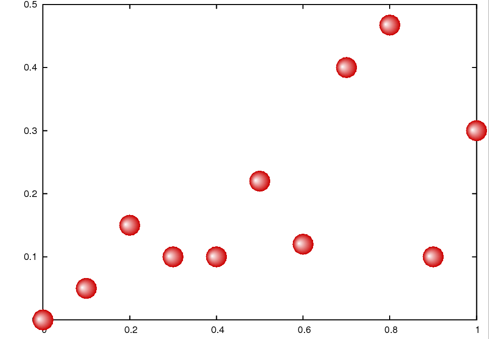
So, if you feel a bit adventurous, you could try to see what can be achieved by manipulating the postscript file. Plot the data points with point type 7 (as a matter of fact, it does not really matter which style you use, but in what follows, I will assume that we have point type 7), and redirect the output to a postscript file, i.e., you would have a gnu script as in
reset
unset key
set border back
set terminal postscript eps enhanced
set output 'bubble.eps'
plot 'bubble.dat' u 1:2 w p pt 7 ps 2
Simple enough, isn't it? (Do not forget to reset the terminal, once you are done with the plot. Otherwise, all your consequent graphs will be written to bubble.eps.)
Now, that we have the postscript file, open it in any text editor, and search for the line
/CircleF { stroke [] 0 setdash hpt 0 360 arc }
This should be somewhere around line 161. This is nothing else than the definition of point type 7, and this definition is used in the actual plotting of your data, somewhere at the end of the postscript file. We will replace the line above by
/CircleF { stroke [] 0 setdash 0 0 0 arc
<< /ShadingType 3
/ColorSpace /DeviceRGB
/Coords [currentpoint exch hpt 1 mul sub exch hpt 0.2 mul add 0 currentpoint 150]
/Function << /FunctionType 2
/Function { 1 }
/Domain [0 1]
/C1 [ 0.8 0 0 ]
/C0 [ 1 1 1 ]
/N 1>> >> shfill} def
While I am not going to write a tutorial on the postscript language, we could certainly see what this does. What we have to keep in mind is that postscript works on stack variables, i.e., we can access various quantities in a top-to-bottom direction, with the last operand being at the top.
First, we take the current x and y coordinates (this is the first currentpoint instruction), and reverse the order of x and y (exch), subtract the value hpt from x (hpt 1 mul sub), reverse the order again, so we are back to the original x-y order, add 0.2*hpt to y (hpt 0.2 mul add). With this set of operations we defined the centre of the colour of our bubble, which is denoted by the next 0. (So, the centre of colour will be to the left and to the top of the geometric centre. North-west, that is.)
Then we define the origin as currentpoint, and the radius as 150. This is the number you should change, if you want to modify the size of the symbol. The next couple of lines define the function type and the domain of this function. /C1 and /C0 determine the colour of the object when the function in question takes on the value of 1 (this will be a bit dark shade of red) and 0 (which will be glowing white). The last line just fills the circle. Now, that we know how this works, we can tweak our figure, if needed. As I said, the size of the bubbles will be determined by the last number on the line beginning with /Coords, and we can move the centre of the colour by changing 0.2 to something else (this would be the y direction), or 1 (x direction). In this way, we can where the light appears to come from. Finally, the colour can be changed by replacing the lines in /C1 and /C0. All in all, we have produced the following figure.
While this might appear a bit grainy, this is only an artefact of the postscript viewer. If you print it out, it is going to be all right.
Plotting bubbles automatically through pm3d
As I pointed out at the beginning, there is an easier route to achieving the same result, in fact, there are two easier ways. First, we will look at the one that uses pm3, then I show the most straightforward of all.
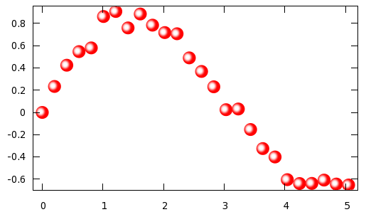
So, let us see, what we could do differently! Let us assume that we have the following data to plot:
0 -0.0694726
0.20202 0.233484
0.40404 0.424311
0.606061 0.546688
0.808081 0.580043
1.0101 0.862214
1.21212 0.907601
1.41414 0.759692
1.61616 0.884879
1.81818 0.784566
2.0202 0.71774...
reset
f(x) = A*exp(-x*x/B/B)
rx=0.107071; ry=0.057876; A = 1; B = 0.2; C=0.5*rx; D=-0.4*ry
g(u,v) = (2*cos(u)*v*rx+C)*(2*cos(u)*v*rx+C)+(3.5*sin(u)*v*ry+D)*(3.5*sin(u)*v*ry+D)
unset key; unset colorbox; set view map
set xrange [-0.15:5.2]; set yrange [-0.7:0.95]
set parametric; set urange [0:2*pi]; set vrange [0:1]
set isosamples 20, 20; set samples 30
set palette model HSV functions 1, 1-f(gray), 1+2*f(gray)
splot cos(u)*rx*v+0.000000,sin(u)*ry*v+0.000000, g(u,v) w pm3d, \
cos(u)*rx*v+0.202020,sin(u)*ry*v+0.233484, g(u,v) w pm3d, \
cos(u)*rx*v+0.404040,sin(u)*ry*v+0.424311, g(u,v) w pm3d, \
cos(u)*rx*v+0.606061,sin(u)*ry*v+0.546688, g(u,v) w pm3d, \
cos(u)*rx*v+0.808081,sin(u)*ry*v+0.580043, g(u,v) w pm3d, \ ...
First, we define a Gaussian; this will be the colouring function, and then define a couple of variables that go into that function. Having done this, we define the function that determines the argument of f(x). The next couple of lines simply sets the ranges and the parametric plot with the parametric ranges, and finally, the number of samples. The last thing we have to define is the palette function. We choose red (i.e., the hue is equal to 1), and the saturation and value are given by 1-f(x) and 1+2*f(x), where the argument is the gray value. At this point, we are ready to plot the points in question. We will simply draw circles with origin x,y, where the x and y values are taken from the data file that we showed above. Note that in fact we are drawing ellipses with axes rx and ry. The reason for this is that the aspect ratio of the plot is not equal to 1, i.e., were we to draw circles, they would look ellipses on the plot. The value of rx and ry are determined by the plot ranges xrange and yrange. (We will see this in the gawk script below.) When plotting the points, we have to plot one circle for each data point, i.e., we have to call the plot function many times, while C and D give the centre of the white spot. increasing C or D will push the white points to the edge of the circles. The results, as expected, are very similar to that in the previous figure
Now, a few words on the various parameters above. The value A determines how bright the bubble will be at its brightest point. 1 corresponds to white, values smaller than 1 give a darker tinge of red. B determines how tight the white spot is. Obviously, rx and ry are the size, so if you want to have smaller circles, you could scale them accordingly, keeping their ratio.
We could easily write a script that takes a data file with two (or more) columns, and turns it into a gnu script along the lines presented above. A possible implementation in gawk is here.
#!/bin/bash
gawk  '{
  if($0!~/#/) {
   x[i] = $1
   y[i] = $2
   if(i==0) { mx = x[i]; my = y[i] }
   if(i>0)   {
         if(max < x[i]) max = x[i]
         if(mix > x[i]) mix = x[i]
         if(may < y[i]) may = y[i]
         if(miy > y[i]) miy = y[i]
   }
   i++
 }
 }
 END { eps = 0.03
  lx = mix-eps*(max-mix)
  hx = max+eps*(max-mix)
  ly = miy-eps*(may-miy)
  hy =  may+eps*(may-miy)
  print "reset"
  print "f(x) = A*exp(-x*x/B/B)"
  printf "rx=%f; ry=%f; A = 1; B = 0.2; C=0.5*rx; D=-0.4*ry\n", 0.02*(hx-lx), 0.035*(hy-ly)
  print "g(u,v) = (2*cos(u)*v*rx+C)*(2*cos(u)*v*rx+C)+(3.5*sin(u)*v*ry+D)*(3.5*sin(u)*v*ry+D)"
  print "unset key; unset colorbox; set view map"
  printf "set xrange [%f:%f]; set yrange [%f:%f]\n", lx, hx, ly, hy
  print "set parametric; set urange [0:2*pi]; set vrange [0:1]"
  print "set isosamples 20, 20; set samples 30"
  print "set palette model HSV functions 1, 1-f(gray), 1+2*f(gray)"
  printf "splot "
    for(k=0;k<i-1;k++) {
         printf "cos(u)*rx*v+%f,sin(u)*ry*v+%f, g(u,v) w pm3d, \\\n", x[k], y[k]
    }
    printf "cos(u)*rx*v+%f,sin(u)*ry*v+%f, g(u,v) w pm3d\n", x[i-1], y[i-1]
 }' $1
At the beginning, we fill up the x[] and y[] vectors, while, at the same time, determining the minimum and maximum of these two vectors. These two values will be used to set xrange and yrange (I defined them a little bit bigger than the minimum and maximum of the vectors, so that the circles are confined in the plot.), and the value of rx and ry, as well. At the end, we simply call the plot function with the arguments that we take from the x[] and y[] vectors.
I believe it should be fairly easy to modify the script, should you want to make some changes to it. Finally, a word of caution: since we use some 900 samples for each circle we plot, this is going to be reflected in the file size, if you use a vector output. As a comparison with the method that I discussed yesterday, the size of that postscript file was something around 20 kB, while the size of the file we would produce with the present method is about 600 kB. We have this big difference simply because yesterday we re-defined one of the symbols, while today we plot each point, without any reference to a particular symbol. Therefore, if you want to include the plot in a publication, it is better to use yesterday's method. For bitmap files, png, jpeg and the like, there should be no significant difference in size.
Plotting bubbles automatically through successive plots
We have already seen in the section on shadowed curves that successive plots can be used to produce a line whose colour changes from place to place. We will use the same trick here to make the dots appear as spheres lit from some distant place. This method is really simple, thus, the only thing I would point out before diving into the code is that with this method you can actuall keep the aspect ratio of 2D plots. The previous method was, in fact, a mapped 3D plot, therefore, the aspect ratios will be a bit strange without doing some hand-work on the figure, i.e., setting the sizes manually.
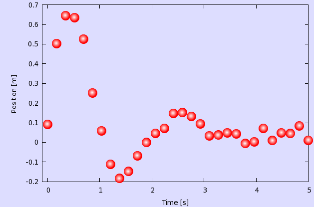
Assuming that our data file is called bubble.dat and x has values between 0 and 5, we write
reset
filename="bubble.dat"
xs=-0.007
ys=0.002
unset key

set object 1 rect from screen 0,0 to screen 1,1 behind fillcolor rgb "#ddddff"
set border back
set xlabel 'Time [s]'
set ylabel 'Position [m]'
p [0+xs:5] filename u 1:2 w p ps 3 pt 7 lc rgb "#ff0000", \
'' u ($1+xs):($2+ys) w p ps 2.6 pt 7 lc rgb "#ff2222", \
'' u ($1+xs):($2+ys) w p ps 2.2 pt 7 lc rgb "#ff4444", \
'' u ($1+xs):($2+ys) w p ps 1.8 pt 7 lc rgb "#ff6666", \
'' u ($1+xs):($2+ys) w p ps 1.4 pt 7 lc rgb "#ff8888", \
'' u ($1+xs):($2+ys) w p ps 1.0 pt 7 lc rgb "#ffaaaa", \
'' u ($1+xs):($2+ys) w p ps 0.6 pt 7 lc rgb "#ffcccc", \
'' u ($1+xs):($2+ys) w p ps 0.2 pt 7 lc rgb "#ffeeee"
We define two variables xs and ys, and draw a rectangle, just to have some background. (You can skip that step.) In the last 8 lines we plot our data 8 times, each time in a different colour (the colour successively becomes whiter) and in different size (the points successively become smaller). At the same time, the centre of the circles is shifted by xs and ys, so that we give the impression that the spheres are lit from the top left corner. By modifying these values, you can move your virtual light source.
The are only three caveats here: one is that since we apply a shift to the data points, we have got to make sure that our xrange and yrange supports the shifter data. This is why, while we have data in [0:5], our xrange is actually [-0.007:5]. The yrange does not require special attention in this case.
The second caveat is that it is perfect for a raster image, it will look quite nasty on a vector image. If you plan on printing the graph through postscript or pdf, you will have to define more levels for the transition from red to white. But the idea is the same, you will simply have more plots on top of each other. In my experience, 10-12 layers should be enough.
And third, when you define your xs and ys, you have to make sure that the successive plots fall entirely on the first one, otherwise your bubbles will have some funny shape. In other words, the sum of the square root of the sum of xs*xs and ys*ys and the second point size (2.6 in our case) must be smaller, than the first point size (3).
If you call the script above, you would get the following image
I will not provide a script for this one, because I feel that this is simple enough, everything can be done by hand. There is only one thing that we could do to make life a bit simpler: in the script above, we had to specify the xrange (and possibly, we would have to do the same with the yrange) by hand, which assumes that we know something about our data file. However, this situation can be alleviated. You can read about this in the section on bargraphs.
by Zoltán Vörös © 2009