Bargraphs
Advanced tricks
Various bargraphs
This all started with the bargraphs. At one point, I very badly needed a bargraph, and I just could not find a way to produce them, so I started to hack the code myself. It did not happen in one step, I experimented with various things. Since most of them are interesting in themselves, I will discuss them one by one.
Cylindrical bargraphs
The key to it is the phonging procedure that we used in the section on phonged surfaces So, here is the code. For ease of use, I defined the values that we want to plot in f1...f7 at the beginning of the file, but we will write a gawk script that simply takes these values from a file, and produces the gnu file accordingly.
A=-1
B=7
C=-4
D=3

# These are the actual values to be plotted
f1 = 1.0
f2 = 1.3
f3 = 0.4
f4 = 1.5
f5 = 1.9
f6 = 1.1
f7 = 0.9

# Radius of cylinders
r = 0.4
# Vertical position of \em phong point
vp = 1.0

unset key
unset colorbox
set sample 100
set isosample 50, 50
set parametric
set urange [0:1]
set vrange [0:1]

set xrange [A:B]
set yrange [C:D]

# Basically, this is the definition of our cylinder
set table 'cylinder.dat'
splot r*sin(2*pi*u), r*cos(2*pi*u), v,\
r*sin(2*pi*u)*v, r*cos(2*pi*u)*v, 1 w pm3d
unset table

set multiplot
set zrange [0:2]
unset xtics
unset ytics
set ztics out
set grid ztics
set ticslevel 0

# First, we draw the 'box' around the plotting volume
set palette model RGB functions 0.9, 0.9,0.95
splot A+(B-A)*u, C+(D-C)*v,0 w pm3d

# These are the vertical panes, with a gradient along
set palette model RGB functions 0.9, 0.9, 0.7+gray/5.0
splot A, C+(D-C)*u, 2*v w pm3d, A+(B-A)*u, D, 2*v w pm3d

set border 1+2+4+8+16+32+64+256+512
f(x,a,b) = 0.9*exp(-(x-a)*(x-a)/b/b)
set palette model RGB function gray, gray, 1
sp 'cylinder.dat' u 1:2:($3*f1):(f($3*f1,vp,0.8)*f($1,0.3,0.2)*f($2,-0.3,0.2)) w pm
'' u ($1+1):2:($3*f2):(f($3*f2,vp,0.8)*f($1+1,1.3,0.2)*f($2,-0.3,0.2)) w pm3d,\
'' u ($1+2):2:($3*f3):(f($3*f3,vp,0.8)*f($1+2,2.3,0.2)*f($2,-0.3,0.2)) w pm3d,\
'' u ($1+3):2:($3*f4):(f($3*f4,vp,0.8)*f($1+3,3.3,0.2)*f($2,-0.3,0.2)) w pm3d,\
'' u ($1+4):2:($3*f5):(f($3*f5,vp,0.8)*f($1+4,4.3,0.2)*f($2,-0.3,0.2)) w pm3d,\
'' u ($1+5):2:($3*f6):(f($3*f6,vp,0.8)*f($1+5,5.3,0.2)*f($2,-0.3,0.2)) w pm3d,\
'' u ($1+6):2:($3*f7):(f($3*f7,vp,0.8)*f($1+6,6.3,0.2)*f($2,-0.3,0.2)) w pm3d

unset multiplot
Loading the script in gnuplot would produce the following image
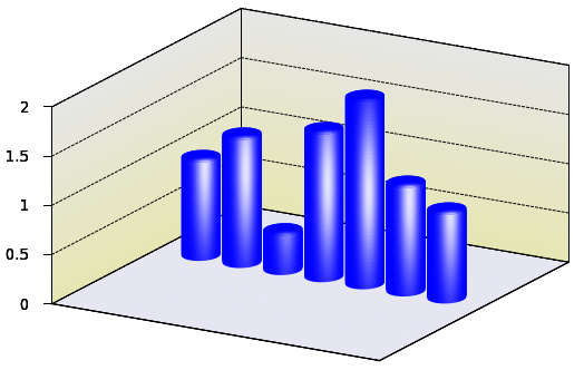
If you look at it, this code is really nothing more than what we have already seen in the section on phonged surfaces: apart from the general set-up commands, we plot the cylinder first to a file, cylinder.dat, (this time, we put on the cap, too), then draw the box in which we plot the bars. To make it more interesting, the vertical panes are given some gradient. You can check out the details of this in this section
Finally, the cylinders are plotted one by one. Each time a new cylinder is processed, we shift it to the right, so that it does not overlap with the previous ones. To make the cylinders 3D-looking, we add the phong, as we discussed it here. If you find that the white spot (actually, it is not completely white, but some very faint shade of blue, some steel-like colour) is too tight, you can ease up a bit on the Gaussian function. You can also shift the vertical position of the centre of the spot by tampering with the value of vp, somewhere at the beginning.
It should go without saying that the task is very repetitive, i.e., it lends itself to scripting. We should not let this opportunity pass by.
#!/bin/bash

gawk '{
		print "A=-1; B=7; C=-4; D=3; r = 0.4; vp = 1.0"
		print "unset key; unset colorbox"
		print "set sample 100; set isosample 50, 50"
		print "set parametric; set urange [0:1]; set vrange [0:1]"
		print "set xrange [A:B]; set yrange [C:D]; set zrange [0:2]"

		print "set table 'cylinder.dat'"
		print "splot r*sin(2*pi*u), r*cos(2*pi*u), v,\"
		print "r*sin(2*pi*u)*v, r*cos(2*pi*u)*v, 1 w pm3d"
		print "unset table"

		print "set multiplot"
		print "unset xtics; unset ytics; set ztics out; set grid ztics; set ticslevel 0"

		print "set palette model RGB functions 0.9, 0.9,0.95"
		print "splot A+(B-A)*u, C+(D-C)*v,0 w pm3d"

		print "set palette model RGB functions 0.9, 0.9, 0.7+gray/5.0"
		print "splot A, C+(D-C)*u, 2*v w pm3d, A+(B-A)*u, D, 2*v w pm3d"

		print "set border 1+2+4+8+16+32+64+256+512"
		print "f(x,a,b) = 0.9*exp(-(x-a)*(x-a)/b/b)"
		print "set palette model RGB function gray, gray, 1"
		printf "splot 'cylinder.dat' u 1:2:($3*f1):(f($3*f1,vp,0.8)*f($1,0.3,0.2)*f($2,-0.3,0.2)) w pm"
		for(i=2;i<=NR;i++) {
			printf "'' u ($1+1):2:($3*%f):(f($3*%f,vp,0.8)*f($1+1,1.3,0.2)*f($2,-0.3,0.2)) w pm3d,\", v[i], v[i]
		}
		print "unset multiplot"
		}' $1
Cuboids
What was good about cylinders in the previous section is that we gave the graph a 3D look by adding phong to the surface. The downside is that cylinders are not the conventional shapes to draw something like this. (As a matter of fact, there is one exception: when one wants to draw a bargraph in 2D, but give it a phong on the 2D surface, which gives the impression that what we are looking at is the projection of a cylinder. For the details of this, you could check out this blog post.) Instead, people plot a rectangular cuboid, and if we want to conform, we have to try that, too.
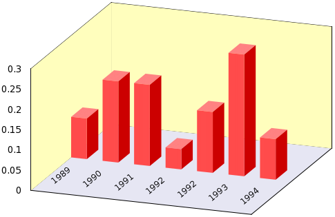
First, let us see how we create the figure above. It is quite easy to plot just one cuboid, and the following gnu script will just do that:
set multiplot
set palette defined (0 1 0.5 0.5, 1 1 0.5 0.5)
splot u, v, B w pm3d
set palette defined (0 1 0.3 0.3, 1 1 0.3 0.3)
splot A+u, 0, v w pm3d
set palette defined (0 0.8 0 0, 1 0.8 0 0)
splot A+u, u, B*v w pm3d
unset multiplot
First, we define our palette. This should have only one colour per face, because we do not want to add any gradient, phong etc. (If you insist, you can add that very easily, you have simply got to follow the recipe in gradient.) Then we plot the top of the cuboid, at a z-level of B, and shifted horizontally by A. In the next step, we re-define our palette, which will now have a slightly darker shade of red, and plot the front surface. In the final step, we move to the third visible face, make it darker, and plot it. In this way, we have drawn one cuboid, and the visual separation of the faces comes about by adding different colours to them. The rest is nothing but the repetition of these three steps, and the general set-up of the graph. Obviously, by changing the order of the palette definitions, one can change the direction from which the light is perceived to come. These efforts would result in the image below
Instead of copying the complete gnu script here, I will just give the gawk script, which processes a file of 2 columns, the first being the label of the bars, and the second containing the actual values. As usual, you can call the script from gnuplot without writing the file to disc as
load '< gawk-script.sh my_data_file.dat'
#!/bin/bash
gawk  'BEGIN {i=0; max=0}
	{
		if($0!~/#/) {
		label[i] = $1
		v[i] = $2
		if(max<v[i]) max=v[i];
		i++
 	}
 	}
	END {
		print "reset"
		print "set view 60, 20; set parametric; set isosample 2, 2"
		print "unset key; unset colorbox"
		print "set ticslevel 0"
		print "set urange [0:0.5]; set vrange [0:1]"
		printf "set xrange [0:%d]; set yrange [-%f:%f]; set zrange [0:%f]\n", i, i/2, i/2, max
		print "set multiplot"
		print "set border 1+2+4+8+16+32+64+256+512; unset ytics; unset xtics"
		print "set palette model RGB functions 0.9, 0.9,0.95"
		printf "splot %d*u, -%f+%d*v, 0 w pm3d\n", 2*i, i/2, i
		print "unset border; unset xtics; unset ytics; unset ztics"
		print "set palette model RGB functions 1, 254.0/255.0, 189.0/255.0"
		printf "splot 0, -%f+%d*v, %f*u w pm3d, %d*u, %f, %f*v w pm3d\n", i/2, i, 2*max, 2*i, i/2, max
		print "set palette defined (0 1 0.5 0.5, 1 1 0.5 0.5)"
		printf "splot "
		for(j=0;j<i-1;j++) {
			printf "%d+u, v, %f w pm3d,\\\n", j, v[j]
		}
		if(i>1) printf "%d+u, v, %f w pm3d\n", i-1, v[i-1]
		print "set palette defined (0 1 0.3 0.3, 1 1 0.3 0.3)"
		printf "splot "
		for(j=0;j<i-1;j++) {
			printf "%d+0.5, 2*u, v*%f w pm3d,\\\n", j, v[j]
		}
		if(i>1) printf "%d+0.5, 2*u, v*%f w pm3d\n", i-1, v[i-1]
		print "set palette defined (0 0.8 0 0, 1 0.8 0 0)"
		for(j=0;j<i;j++) {
			printf "set label %d \"%s\" at %f, %f rotate by 40\n", j+1, label[j], j+0.3, -i/2+1
		}
		printf "splot "
		for(j=0;j<i-1;j++) {
			printf "%d+u, 0, v*%f w pm3d,\\\n", j, v[j]
		}
		if(i>1) printf "%d+u, 0, v*%f w pm3d\n", i-1, v[i-1]
		print "unset multiplot"
}' $1
The generalisation to more than 1 data column should be trivial: you have only got to choose your colours, and re-size the bars in the x-y directions accordingly.
Bargraphs - entirely in gnuplot
If you look at the scripts above, it becomes immediately clear that plotting the bargraph is not plotting in the usual sense: we have to do something depending on a particular value at a particular position in the data file, i.e., we cannot just let gnuplot do this as we would plot the second column versus the first column. In order to access the individual data points, we used an external script above, but we can avoid that relatively easily. We have already seen one of the tricks in the section discussing the pie chart, and one in the section on the recession line: using the fit function we can read out the values in the file one by one, and plot the values through one or two for loops.
We will produce a plot entirely with gnuplot, and without even knowing how many, and of what magnitude the elements are. We can achieve this by making use of some gnuplot variables. Since I will build upon the tricks that we exploited in the section on pie chart, I would recommend that you read the chapter, if you haven't already done so.
Let us suppose that we have the following data file, called bar_matrix.dat, with 4 by 4 real numbers (which we do not know in advance, mind you!)
1 0.5 2.2 0.5
1.2 0.6 -2.4 0.2
0.1 0.5 -1.8 -1.5
1.2 0.3 0.6 1.9
and we want to generate a plot similar to this:
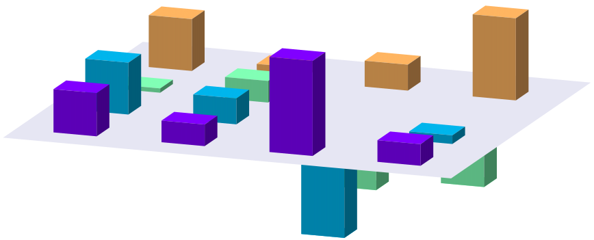
Following the recipe from the pie charts, we have to read out the numbers in the matrix, one by one, and plot the cuboids one by one. In order to give the impression of a 3D object, the three visible sides of the cuboids must be painted with different shades of the same colour, but that should not be a problem, we have already seen how to do that. However, there is one difficulty here: we will have to use multiplot, which means that in order to keep the relative size of the cuboids, we have to fix all three ranges, xrange, yrange, and zrange. In addition, determining the xrange and yrange serves not only some aesthetic purpose, but they will also control our for cycle. So, what can we do to crack this nut?
In order to answer the question, we have got to think about how gnuplot plots: first, if no ranges are specified, data are read in, then based on certain values, the ranges are calculated. If we have a file named something.dat, and we issue
plot 'something.dat' using 1:2
the first, and second columns of <it>something.dat</it> will be read, and based on the minimum and maximum values of the first column, the xrange is calculated, and likewise for the yrange. But then these values are stored as a special variable in gnuplot. If you are interested in the minimum and maximum of your xrange, you can instruct gnuplot to print them as
print GPVAL_DATA_Y_MIN
print GPVAL_DATA_Y_MAX
You can also print out all variables (and it is quite instructive, by the way), both user-defined and internal, by typing
show variables all
Now, this means that we will have access to some properties of our data file, provided that the data file has been plotted at least once. Here are should point out that some constants (e.g., the minimum and maximum of the data set and so on) are determined for a particular range, i.e., if you plot over an xrange of [0:2], then only those points in the [0:2] interval will determine the maximum. This is something that we have to keep in mind sometime later. This is the trick what we will use in the following script, called bar_matrix.gnu.
reset
filename="bar_matrix.dat"
w=0.4
FIT_LIMIT=1e-8
mult=1.05; cd=1.4

f(x,a)=(abs(x-a)<0.5?d:0)
R(x)=abs(2*x-0.5); G(x)=sin(x*pi); B(x)=cos(x*pi/2.0)

set view 60, 20
set parametric; set isosample 2, 2
unset border; unset tics; unset key; unset colorbox
set ticslevel 0
set urange [0:1]; set vrange [0:1]

splot 'bar_matrix.dat' mat
set zrange [mult*GPVAL_DATA_Z_MIN:mult*GPVAL_DATA_Z_MAX]
Y=GPVAL_DATA_Y_MAX+1
X=GPVAL_DATA_X_MAX+1

set xrange [1-w:X+2*w]

set multiplot

C=0; xx=1; yy=Y
call 'bar_matrix_r.gnu'

set palette model RGB functions 0.9, 0.9,0.95
splot -w+u*(X+3*w), -w+v*(Y+w), 0 w pm3d

C=1; xx=1; yy=Y
call 'bar_matrix_r.gnu'
unset multiplot
In addition to this file, we will need two more. Remember, in order to plot a matrix, we have to use two for cycles, each requiring an external gnuplot script. So, we also have bar_matrix_r.gnu
yy=Y
call 'bar_matrix_r2.gnu'
xx=xx+1
if(xx<X+1) reread
</pre>
and \em bar_matrix_r2.gnu
<pre class="code">
unset parametric
yy=yy-1
d=0.3
set yrange [*:*]
fit [0:Y] f(x,yy) filename u 0:xx via d
set yrange [-w:Y+2*w]
set parametric
r=R(yy/Y); g=G(yy/Y); b=B(yy/Y)
if(C==0 && d<0) \
set palette defined (0 r g b, 1 r g b);\
splot w*u+xx, w*v+yy, d w pm3d;\
r=r/cd; g=g/cd; b=b/cd;\
set palette defined (0 r g b, 1 r g b);\
splot w*u+xx, yy, v*d w pm3d;\
r=r/cd; g=g/cd; b=b/cd;\
set palette defined (0 r g b, 1 r g b);\
splot w+xx, yy+w*u, v*d w pm3d;

if(C==1 && d>0) \
set palette defined (0 r g b, 1 r g b);\
splot w*u+xx, yy+w*v, d w pm3d;\
r=r/cd; g=g/cd; b=b/cd;\
set palette defined (0 r g b, 1 r g b);\
splot w*u+xx, yy, v*d w pm3d;\
r=r/cd; g=g/cd; b=b/cd;\
set palette defined (0 r g b, 1 r g b);\
splot w+xx, yy+w*u, v*d w pm3d;

if(yy>0) reread
Having listed the scripts, let us discuss what the three files do. The beginning of bar_matrix.gnu should be familiar by now, there is nothing new in it. The first interesting thing happens where we do a dummy plot of the matrix, just to extract the number of rows and columns, and the range of the data values. We use GPVAL_DATA_Z_MIN and GPVAL_DATA_Z_MAX to set the common zrange of all consequent figures, and GPVAL_DATA_X_MAX and GPVAL_DATA_Y_MAX to determine the number of iterations (and the xrange, and yrange, of course). Note that we use a multiplier, mult, defined at the beginning of the file, so that the top and bottom of the plot will definitely not be clipped. (This also means that if you want to have more/less space above/below your plot, you can modify the value of mult to stretch the figure.) Then we clear our plot by setting the multiplot, and calling bar_matrix_r.gnu. This file controls the for cycles over rows. It does nothing, but re-sets the value of the inner for cycle, increments its own variable, and calls bar_matrix_r2.gnu. In this second for loop is where the actual plotting takes place (that is, this is where you can change the lookout, colour and so on of the figure). In that file, we call our fitting routine (to determine the height of the corresponding bar), set the palette, and plot the 3 sides of the cuboids. Note that we want to paint the sides in different colours, so after plotting the top, we produce a darker shade by dividing all RGB values by cd, and after plotting the front side, we reduce the RGB values once more, to draw the right hand side. By changing the sequence by which you give the colours, you can effectively change the direction of lighting.
Now, this script contains an if statement, with the variable C and d. The reason for this is that we call bar_matrix_r.gnu twice: first we plot all bars that represent a negative value, then draw the z=0 plane, and finally plot the positive values. This is what happens in the last couple of lines of bar_matrix.gnu. If you are certain that your matrix contains positive values only, you can get rid of the if statement, and also of the first call of bar_matrix_r.gnu. If you now call bar_matrix.gnu from gnuplot, you will get the figure above. You can then add labels and so on, as you wish. I would also like to point out that human intervention is required only at the very beginning of bar_matrix.gnu, where we specify the name of the file that we want to plot. Otherwise, everything is automatic, and will just happen by the stroke of the key. You should also keep in mind that we had a dummy plot, so if you want to plot into a file, you have got to set the terminal after this plot, lest you should not have the dummy plot in your file.
by Zoltán Vörös © 2009