Pie charts
Pie charts
I believe, pie charts are gnuplot's Achilles' heel, and they are the kind of charts that disappoint most people. Even if they do not carry any information that could not be presented in a different way, they are quite popular, especially in presentations. (About 25% of the search terms that bring people to my blog are concerned with pie charts.) Here we will walk a long walk and explore what can be done about this dire state of the affair, starting with the simplest pie chart, in 2D, and ending with their 3D versions.
The simplest pie chart
First, we assume that we have the following data to plot:1988, 1989, 1990, 1991, 1992, 1993 0.1, 0.2, 0.15, 0.15, 0.3, 0.1
(I made certain that they add up to 1.) In the case of a pie chart, the independent variable does not make too much sense, it only acts as the label for the various pieces. Here is the code that can be used to generate the figure below.
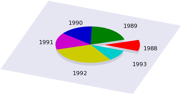
reset
a1=0.1
a2=0.2
a3=0.15
a4=0.15
a5=0.3
a6=0.1

b=0.4
s=0.2
B=0.5

set view 30, 20
set parametric
unset border
unset tics
unset key
set ticslevel 0
unset colorbox
set urange [0:1]
set vrange [0:1]
set xrange [-2:2]
set yrange [-2:2]
set zrange [0:3]
set multiplot

# First, we draw the 'box' around the plotting volume
set palette model RGB functions 0.9, 0.9,0.95
splot -2+4*u, -2+4*v, 0 w pm3d

set palette model RGB functions 0.8, 0.8, 0.85

set urange [a1:1]
splot cos(u*2*pi)*v, sin(u*2*pi)*v, 0 w pm3d

set urange [0:a1]
splot cos(a1*pi)*b+cos(u*2*pi)*v, sin(a1*pi)*b+sin(u*2*pi)*v, 0 w pm3d

set palette model RGB functions 1, 0, 0
set urange [0:a1]
splot cos(a1*pi)*b+cos(u*2*pi)*v, sin(a1*pi)*b+sin(u*2*pi)*v, s w pm3d

set palette model RGB functions 0, 0.5, 0
set urange [a1:a1+a2]
splot cos(u*2*pi)*v, sin(u*2*pi)*v, s w pm3d

set palette model RGB functions 0, 0, 0.8
set urange [a1+a2:a1+a2+a3]
splot cos(u*2*pi)*v, sin(u*2*pi)*v, s w pm3d

set palette model RGB functions 0.8, 0, 0.8
set urange [a1+a2+a3:a1+a2+a3+a4]
splot cos(u*2*pi)*v, sin(u*2*pi)*v, s w pm3d

set palette model RGB functions 0.8, 0.8, 0
set urange [a1+a2+a3+a4:a1+a2+a3+a4+a5]
splot cos(u*2*pi)*v, sin(u*2*pi)*v, s w pm3d

set palette model RGB functions 0, 0.8, 0.8
set urange [a1+a2+a3+a4+a5:a1+a2+a3+a4+a5+a6]
set label 1 '1988' at  cos(a1*pi)*B+cos(a1*pi), sin(a1*pi)*B+sin(a1*pi)
D = 2*a1+a2
set label 2 '1989' at  cos(D*pi)*B+cos(D*pi), sin(D*pi)*B+sin(D*pi)
D=D+a2+a3
set label 3 '1990' at  cos(D*pi)*B+cos(D*pi), sin(D*pi)*B+sin(D*pi)
D=D+a3+a4
set label 4 '1991' at  cos(D*pi)*B+cos(D*pi), sin(D*pi)*B+sin(D*pi)
D=D+a4+a5
set label 5 '1992' at  cos(D*pi)*B+cos(D*pi), sin(D*pi)*B+sin(D*pi)
D=D+a5+a6
set label 6 '1993' at  cos(D*pi)*B+cos(D*pi), sin(D*pi)*B+sin(D*pi)
splot cos(u*2*pi)*v, sin(u*2*pi)*v, s w pm3d
unset multiplot
The values in the chart are defined in a1 through a6. Then, we set up our figure in the usual way, and first we plot the plane and the shadow of the slices. In order to draw slices, we use a simple parametrisation of an arc of a circle, and shift the boundaries of the u parameter. Note that one of the slices is off set, so it looks as if the pie chart had exploded. The extent to which the single slice is moved out is given by the value of b, while B sets the distance of the labels from the centre. These two numbers will, in general, determine what the figure looks like.
Once we are done with this, we can set out to draw the actual slices. In order to colour them with a different colour, we change the palette as we proceed, and change the parameter range of u. Before the last slice, we put out the labels as well, so that they will be displayed when the last piece is drawn.
Now, this seems to be a bit convoluted, and more importantly, it's quite inconvenient to put all values in by hand. We can write a simple script to produce the gnu script. One possible implementation in gawk is given here.
#!/bin/bash
gawk  '{
	if($0!~/#/) {
		i++
 		label[i] = $1
 		v[i] = $2
 		D+= $2
	}
	}
	END {
		print "reset"
		print "b=0.4; a=0.2; B=0.5"
		print "set view 30, 20; set parametric"
		print "unset border; unset tics; unset key; unset colorbox"
		print "set ticslevel 0"
		print "set urange [0:1]; set vrange [0:1]"
		print "set xrange [-2:2]; set yrange [-2:2]; set zrange [0:3]"
		print "set multiplot"
		print "set palette model RGB functions 0.9, 0.9,0.95"
		print "splot -2+4*u, -2+4*v, 0 w pm3d"
		print "set palette model RGB functions 0.8, 0.8, 0.85"
		printf "set urange [%g:1]\n", v[0]/D
		print "splot cos(u*2*pi)*v, sin(u*2*pi)*v, 0 w pm3d"
		printf "set urange [0:%g]\n", v[0]/D
		printf "splot cos(%g*pi)*b+cos(u*2*pi)*v, sin(%g*pi)*b+sin(u*2*pi)*v, 0 w pm3d\n", v[0]/D, v[0]/D
		print "set palette model RGB functions 1, 0, 0"
		printf "set urange [0:%g]\n", v[0]/D
		printf "splot cos(%g*pi)*b+cos(u*2*pi)*v, sin(%g*pi)*b+sin(u*2*pi)*v, a w pm3d\n", v[0]/D, v[0]/D, d=v[0]/D
		for(j=1;j<i;j++) {
			printf "set palette model RGB functions %g, %g, %g\n", (j%3+1)/3, (j%6+1)/6, (j%9+1)/9
			printf "set urange [%g:%g]\n", d, d+v[j]/D
			print "splot cos(u*2*pi)*v, sin(u*2*pi)*v, a w pm3d"
			d+=v[j]/D
		}
		d=v[1]/D
		for(j=1;j<i;j++) {
			printf "set label %d \"s\" at cos(%g*pi)*B+cos(%g*pi), sin(%g*pi)*B+sin(%g*pi)\n", j+1, label[j], d, d, d, d
d=d+v[j]/D+v[j+1]/D
		}
		printf "set label %d \"s\" at cos(%g*pi)*B+cos(%g*pi), sin(%g*pi)*B+sin(%g*pi)\n", i, label[i-1], d, d, d, d
		printf "set palette model RGB functions %f, %f, %f\n", (i%3+1)/3, (i%6+1)/6, (i%9+1)/9
		printf "set urange [%g:1]\n", 1.0-v[i-1]/D
		print "splot cos(u*2*pi)*v, sin(u*2*pi)*v, a w pm3d"
		print "unset multiplot"
}' $1
This is really nothing but the mechanical implementation of our gnuplot script. The only difference with respect to that is that we had to set the colour palette mechanically, which we did by giving the values (j%3+1)/3, (j%6+1)/6, (j%9+1)/9. If you are not satisfied with the colouring of your output, you can easily tamper with this, and get something that you like more.
Now, if you make this executable and call it, pie.sh, say, and have a file with two columns, the first one being the label for a particular value, then you can simple call this script from gnuplot as
load "< ./pie.sh pie.dat"
Also note that we no longer have got to normalise the sum of the values to one, because the script takes care of that.
I should point out here that others implemented this script in php and perl. If your application requires either of those languages, you should check out Hellson's web site for the php script, or Ka-Wai's web site for the perl module.
Making the pie in gnuplot 4.3
In gnuplot 4.2, a new concept, the set object command was introduced. At that time, only rectangles could be set. (We take advantage of this in the section on shadowed keys.) However, in 4.3, the circle, the ellipse, and the polygon were added to the object set, and an arc of a circle can be set as simply as
set obj 1 circle arc [0:30] fc rgb "red" at screen 0.5, 0.5 size screen 0.2
which will draw a red arc of $30^{}$ at the centre of the screen, with a radius of 0.2. Obviously, this can be used to make the pie. However, this works only on 2D plots, and we cannot give the impression of viewing the image from a 3D perspective. All the same, I will present a script that does the job in 4.3. We will assume the same data as above, and for the sake of convenience, we will multiply all numbers by 360.
reset
unset border
unset tics

b=0.25
s=0.05
B=0.5

a1=0.1*360
a2=a1+0.2*360
a3=a2+0.15*360
a4=a3+0.15*360
a5=a4+0.3*360
set angles degree
set yrange [0:1]
set style fill solid 1.0 border -1
set obj 1 circle arc [0:a1] fc rgb "red"
set obj 2 circle arc [a1:a2] fc rgb "orange"
set obj 3 circle arc [a2:a3] fc rgb "yellow"
set obj 4 circle arc [a3:a4] fc rgb "forest-green"
set obj 5 circle arc [a4:a5] fc rgb "dark-turquoise"
set obj 6 circle arc [a5:360] fc rgb "dark-magenta"\n
set obj 1 circle at screen B+s*cos(a1/2),B+s*sin(a1/2) size screen b front
set obj 2 circle at screen B,B size screen b front
set obj 3 circle at screen B,B size screen b front
set obj 4 circle at screen B,B size screen b front
set obj 5 circle at screen B,B size screen b front
set obj 6 circle at screen B,B size screen b front
plot 2
This all can be automated, using the following gawk script
#!/bin/bash

gawk 	'{
		i++
		if($0!~/#/) {
			label[i] = $1
			v[i] = $2
			D+= $2
	    }
	}
	END {
		d = v[1]
		print "reset"
		print "b=0.4; a=0.2; B=0.5"
		print "unset border; unset tics; unset key"
		print "set angles degree; set yrange [0:1]; set style fill solid 1.0 border -1"
		for(j=1;j<=i;j++) {
			printf "set obj %d circle arc [0:%g] fc lt %d", j, d, j
			printf "set obj %d circle at screen B,B size screen b front", j
			d+=v[j]/D
		}
		d=v[1]/D
		for(j=1;j<i;j++) {
			printf "set label %d \"%s\" at cos(%f*pi)*B+cos(%f*pi), sin(%f*pi)*B+sin(%f*pi)\n", j+1, label[j], d, d, d, d
			d=d+v[j]/D+v[j+1]/D
		}
	}' $1
which, except for the particular colours, produces the same pie plot as the other script.
Moving to the 3rd dimension
Above, I showed how we can draw a very simple 2D pie chart embedded in 3D space in gnuplot. Or, at least, give the impression that light impinges upon our chart, and it casts a shadow.It is time to try our hand at a real 3D pie chart, especially, that we have basically learnt everything that we need in the previous paragraph. The only extra step required is to draw the side of the cylinder, with the proper colouring. Once we do this, we get a figure similar to this one:
The trick to this is that not only do we plot an arc of a circle (which will be on the top), but we also plot the side of the cylinder (which will be, well, on the side). The only thing we have to keep in mind is that the cover comes on top, i.e., we have to draw all sides first, and only then do we draw the arcs on the top.
Since it would not make too much sense to show the full gnu script here, I give only the relevant plotting command, and then give a gawk implementation.
...
set palette model RGB functions 0.333333, 0.166667, 0.111111
set urange [0.000000:0.090909]
splot cos(u*2*pi)*r, sin(u*2*pi)*r, s+v*a w pm3d
...
splot cos(u*2*pi)*r*v, sin(u*2*pi)*r*v, s+a w pm3d
...
where the first plot is the size, the second is the top of the slices of the pie. Then the script
#!/bin/bash
gawk  '{
	if($0!~/#/) {
		i++
 		label[i] = $1
 		v[i] = $2
 		D+= $2
	}
	}
	END {
		print "reset"
		print "b=0.4; a=0.4; B=0.5; r=1.0; s=0.1"
		print "set view 30, 20; set parametric"
		print "unset border; unset tics; unset key; unset colorbox"
		print "set ticslevel 0"
		print "set urange [0:1]; set vrange [0:1]"
		print "set xrange [-2:2]; set yrange [-2:2]; set zrange [0:3]"
		print "set multiplot"
		print "set palette model RGB functions 0.9, 0.9,0.95"
		print "splot -2+4*u, -2+4*v, 0 w pm3d"
		print "set palette model RGB functions 0.8, 0.8, 0.85"
		print "splot cos(u*2*pi)*v, sin(u*2*pi)*v, 0 w pm3d"
		d=0.0;
		for(j=0;j<i;j++) {
 			printf "set palette model RGB functions %g, %g, %g\n", (j\%3+1)/3, (j\%6+1)/6, (j\%9+1)/9
 			printf "set urange [%g:%g]\n", d, d+v[j]/D
 			print "splot cos(u*2*pi)*r, sin(u*2*pi)*r, s+v*a w pm3d"
 			print "splot cos(u*2*pi)*r/2, sin(u*2*pi)*r/2, s+v*a w pm3d"
 			d+=v[j]/D
		}

		d=0.0;
		for(j=0;j<i-1;j++) {
 			printf "set palette model RGB functions %g, %g, %g\n", (j\%3+1)/3, (j\%6+1)/6, (j\%9+1)/9
 			printf "set urange [%g:%g]\n", d, d+v[j]/D
 			print "splot cos(u*2*pi)*r*v, sin(u*2*pi)*r*v, s+a w pm3d"
 			d+=v[j]/D
		}
		d=v[0]/D;
		for(j=0;j<i;j++) {
 			printf "set label %d \"%s\" at cos(%g*pi)*B+cos(%g*pi), sin(%g*pi)*B+sin(%g*pi) centre\n", j+1, label[j], d, d, d, d
 			d=d+v[j]/D+v[j+1]/D
		}
		printf "set palette model RGB functions %g, %g, %g\n", ((i-1)\%3+1)/3, ((i-1)\%6+1)/6, ((i-1)\%9+1)/9
		printf "set urange [%g:1]\n", 1.0-v[i-1]/D
		print "splot cos(u*2*pi)*v, sin(u*2*pi)*v, a+s w pm3d"
		print "unset multiplot"
}' $1
Again, you needn't even write the gnu file to disc: if your script is called pie3d.sh, you can call the gawk script from gnuplot as
load "< pie3d.sh pie.dat"
Now, this is not everything. We can easily turn our pie charts into doughnut charts, i.e., the pie charts whose centre is missing, as in this one
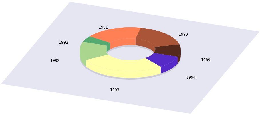
(Of course, we could begin a cullinary debate on whether this creature can qualify as a pie. I am sure some people would argue that it could not.) It is very easy to hack our gnu file above to achieve something like this: the only thing we have to do is to restrict the dummy variable in the parametric plot, so that instead of 0 to 1, now it runs from 0.5 to 1. The relevant plot commands are
set palette model RGB functions 0.333333, 0.166667, 0.111111
set urange [0.000000:0.090909]
splot cos(u*2*pi)*r, sin(u*2*pi)*r, s+(1-v)*a*2 w pm3d
...
splot cos(u*2*pi)*r/2, sin(u*2*pi)*r/2, s+(1-v)*a*2 w pm3d
...
splot cos(u*2*pi)*r*v, sin(u*2*pi)*r*v, s+a w pm3d
However, when doing this, we have got to be a bit careful: that particular dummy variable appears at more than one place, so we have to make sure that the actual range does not change where we do not want it to change. The snag is that these ranges are linked to each other. But that should really not be a problem, as long as we know what we are doing! Again, I will not give the full gnu script, only the gawk implementation.
#!/bin/bash
gawk  '{
	if($0!~/#/) {
		i++
 		label[i] = $1
 		v[i] = $2
 		D+= $2
 	}
	}
	END {
		print "reset"
		print "b=0.4; a=0.4; B=0.5; r=1.0; s=0.1"
		print "set view 30, 20; set parametric"
		print "unset border; unset tics; unset key; unset colorbox"
		print "set ticslevel 0"
		print "set urange [0:1]; set vrange [0.5:1]"
		print "set xrange [-2:2]; set yrange [-2:2]; set zrange [0:3]"
		print "set multiplot"
		print "set palette model RGB functions 0.9, 0.9,0.95"
		print "splot -2+4*u, -2+4*(1-v)*2, 0 w pm3d"
		print "set palette model RGB functions 0.8, 0.8, 0.85"
		print "splot cos(u*2*pi)*v, sin(u*2*pi)*v, 0 w pm3d"
		d=0.0;
		for(j=0;j<i;j++) {
 			printf "set palette model RGB functions %g, %g, %g\n", (j\%3+1)/3, (j\%6+1)/6, (j\%9+1)/9
 			printf "set urange [%g:%g]\n", d, d+v[j]/D
 			print "splot cos(u*2*pi)*r, sin(u*2*pi)*r, s+(1-v)*a*2 w pm3d"
 			print "splot cos(u*2*pi)*r/2, sin(u*2*pi)*r/2, s+(1-v)*a*2 w pm3d"
 			d+=v[j]/D
		}
		d=0.0;
		for(j=0;j<i-1;j++) {
 			printf "set palette model RGB functions %g, %g, %g\n", (j\%3+1)/3, (j\%6+1)/6, (j\%9+1)/9
 			printf "set urange [%g:%g]\n", d, d+v[j]/D
 			print "splot cos(u*2*pi)*r*v, sin(u*2*pi)*r*v, s+a w pm3d"
 			d+=v[j]/D
		}
		d=v[0]/D;
		for(j=0;j<i;j++) {
 			printf "set label %d \"%s\" at cos(%g*pi)*B+cos(%g*pi), sin(%g*pi)*B+sin(%g*pi) centre\n", j+1, label[j], d, d, d, d
 			d=d+v[j]/D+v[j+1]/D
		}
		printf "set palette model RGB functions %g, %g, %g\n", ((i-1)\%3+1)/3, ((i-1)\%6+1)/6, ((i-1)\%9+1)/9
		printf "set urange [%g:1]\n", 1.0-v[i-1]/D
		print "splot cos(u*2*pi)*v, sin(u*2*pi)*v, a+s w pm3d"
		print "unset multiplot"
}' $1
One comment I could add here (and this applies to the real 3D pie) is that we can emphasise the 3D look of the pie by changing the colour of the top to something brighter (or, conversely, changing the sides to something darker). This can easily be done by defining a multiplier, mult=0.9, say, and multiplying all RGB values by this number when we plot the sides. This is a trivial modification.
The slice of the pie
Now, we have seen how to make an exploded 2D pie chart, and a solid 3D chart. Do you think we could combine the two? But of course, we could, you have simply got to read on! I believe, once you see the trick, you will say that it was trivial, but this is why we should not let it pass by.The main difficulty here is that once we cut the pie, some parts will cover others, and it is not so obvious in which order we should draw the arcs, planes and the like to keep the order of distances from the viewer. Gnuplot has a function for that, or actually, it is a flag for pm3d, but that is not respected by multiplot, i.e., we cannot let gnuplot determine the distance of the elements from the viewer, for it would miserably fail, simply because those elements are not parts of the same plot, so we have got to part with that notion. Therefore, this whole affair could be much easier, if we were able to manage to put everything, or at least, the crucial pieces in one plot. I will start out with a particular example, but then I will show how this can be automated, so you just have to give the file name, and the rest will be done by the script. But, just to wet your appetite, here is the figure
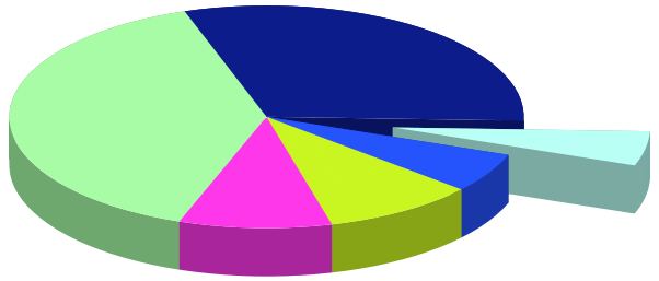
Now, let us get down to business! We have six data points, which, for the sake of simplicity, are called
A=0.05*2*pi; B=0.3*2*pi; C=0.4*2*pi; D=0.1*2*pi; E=0.1*2*pi; FF=0.05*2*pi
The last one is not really relevant, for the sum of these numbers is 2 pi(e), and FF is not used anywhere at all. If you recall, the reason for having to use multiplot was that when we put the pieces together, we changed the palette after each step, so the next piece, by default, had to be in a separate plot, and then we couldn't use depth ordering any more. Since we need different colours for the slices, the only way out of the loophole that I mentioned above is that we plot everything into a file, and then plot the file. When doing so, we need to specify the colour by a separate function, but that is really easy. After this introduction, let us see the script, which I will discuss further.
reset
b=0.5; a=0.5; r=1.0; s=0.1; m=1.5; eps=1e-4; N=6
A=0.05*2*pi; B=0.3*2*pi; C=0.4*2*pi; D=0.1*2*pi; E=0.1*2*pi; FF=0.05*2*pi

f(x,n) = (x>n?0.0:1.0)
F(x) = 1+f(x,A-eps)+f(x,A+B)+f(x,A+B+C)+f(x,A+B+C+D)+f(x,A+B+C+D+E)
at(y,x) = (x==0.0?0:(atan2(y,x)>0.0?F(atan2(y,x)):F(atan2(y,x)+2*pi)))

c(u,v,q)=cos(u)*r*v+q*cos(A/2); s(u,v,q)=sin(u)*r*v+q*sin(A/2)
C(u, q) = cos(u)*r+q*cos(A/2); S(u,q) = sin(u)*r+q*sin(A/2)
z = s+a; Z(v) = s+a*v

rg(x) = abs(cos(100*x/7))
gg(x) = abs(cos(100*x/11-pi/2))
bg(x) = abs(cos(100*x/13+pi/2))

set view 30, 20; set parametric
unset border; unset tics; unset key; unset colorbox; set ticslevel 0
set pm3d depthorder; set pal maxcolor N+1
set vr [0:1]; set xr [-1.5:1.5]; set yr [-1.5:1.5]; set zr [0:2]; set cbr [0:2*pi]

set multiplot
set iso 2, 2
set table 'pieslice2.dat'
set ur [A+eps:2*pi]
splot C(u,-eps), S(u,-eps), Z(v)
set ur [0+eps:A-eps]
splot C(u,b), S(u,b), Z(v)
set ur [0:1]
splot u*r, 0, Z(v), u*r*cos(A), u*r*sin(A), Z(v), \
u*r+b*cos(A/2), b*sin(A/2), Z(v), u*r*cos(A)+b*cos(A/2), u*r*sin(A)+b*sin(A/2), Z(v)
unset table

set iso 2, 80
set table 'pieslice3.dat'
set ur [A+eps:2*pi]
splot c(u,v,0-eps), s(u,v,0-eps), z
set iso 2, 2
set ur [0:A]
splot c(u,v,b), s(u,v,b), z
unset table
unset multiplot

set multiplot
set pal functions rg(gray)/m, gg(gray)/m, bg(gray)/m
sp 'pieslice2.dat' u 1:2:3:(at($2,$1)) w pm3d

set pal functions rg(gray), gg(gray), bg(gray)
splot 'pieslice3.dat' u 1:2:3:(at($2,$1)) w pm3d
unset multiplot
OK, so let us see what is happening here! In the first line, we define a couple of things that will determine the look-out of our figure. b will be the shift of the cut-out, a is the pie's height, r is its radius, m will determine the shade of the sides, with respect to the top, and eps is just a small number whose role will become clear in a second. And finally, N is the number of our data points. Then come the data points. After this comes the heavy part. Literally!
f(x,n) is a Heaviside function, which we use in the colour scheme. Remember that we want to colour the pie according to a function that depends on the azimuth angle. We will have a number of colours, and change the pm3d colour whenever the angle crosses the next value in our data set. If you look closely, our F(x) increases by one at each such point. (This is why we needed the Heaviside function.) That is, we could use F(angle) to colour our plot! However, there is a small glitch: since we are going to plot into a file first, we lose the information on the angle, and we will have to undo the polar-Cartesian transformation. This is why we need some distorted version of the atan2 functions. With the definition given here, we can make sure that it returns values in [0:2 PI], and there isn't a phase jump at (-1, 0).
Having defined these 3 functions, we define our shapes. These are just arcs of circles and rectangles, so I will not discuss them here. The next three lines will determine the colour scheme. If you are unhappy with the pie that you get, you should change these lines here. Basically, you want to have something in which consecutive colours are not close (in whatever sense), and one that does not wrap, i.e., you do not get the same colour for the first and last slice.
The next 4 lines define some properties of the image. There are only two things to watch out for: one is that we fix the number of colours in our palette, namely, 7. The second is that we fix the range of the palette: this is done by the
set cbr [0:2*pi]
where cbr stands for cbrange.
By now, we have set everything, so we are ready to plot, first to files. We will have two files, pieslice2.dat and pieslice3.dat. The first one will hold the side of the pies, while the second is the top. The only reason for putting them in two separate files is that we want darker colours for the sides. These plots are trivial, and should speak for themselves. The only exception is the shift by 'eps'. We did this, so that the atan2 function is everywhere defined. Otherwise, we would have points at (x,y) = (0,0), where the atan2 function would return an undefined value, and that would just give us a hole in the plot. Also note that we have set the number of isosamples. We have only 2, where high resolution is not required, and set it to larger numbers only where needed. This improves on speed, but more importantly, reduces the size of the file considerably, if redirected it to some vector graphics format, e.g., EPS, or PDF. This really makes a lot of difference!
At this point, we have all data in two files, so we can simply plot them. We plot them separately, because we want to colour them differently, so we have to change the palette. But these steps are really straighforward. The pie is there, if you want to put a background, labels, etc., you can do it here.
At the beginning, I mentioned that this whole business can be done automatically. If you look at the script above, you will notice that the variables and all related functions are defined at the beginning: N was the number of samples, then we had the data points, and finally, F(x) depends on the data. So, if we have a script that prints all these into a file, we can load that file there, and the rest is unchanged. Therefore, we have simply move those definitions to a separate file (which can be the output of a script), and load that file immediately after we defined f(x,n). So, if we call that file pie_l.gnu, that would contain the following two lines
N=7
F(x) = 1+f(x,0.314)+f(x,2.199)+f(x,4.712)+f(x,5.34)+f(x,5.969)
and nothing else. At this point, we can either let a script write these numbers to pie_l.gnu, or just print it to the standard output, and re-direct that output to gnuplot as
load '< somescript somedata.dat'
The following gawk script should do the job, provided that you want to process the first column in your data file. The script also normalises, so arbitrary numbers can be used.
#!/bin/bash
gawk 'BEGIN {sum=0.0; i=0}
    {       a[i] = sum+$2
            sum += $2
            i++
    }
    END {   printf "N=%d\n", i
            printf "F(x) = 1"
            for(j=0;j<i-1;j++) printf "+f(x,%f)", 6.28318530717959*a[j]/sum
            printf "\n"
    }' $1
Pie charts - entirely in gnuplot
Above, we discussed various ways to produce a pie chart in gnuplot. By looking at the search terms that bring people to my blog, and it seems that this topic is one of the more popular, so I thought that it might be worthwhile to explore the issue more.
Since I am a Linux fan, I am quite fine with calling various scripts from gnuplot: pipes are rather convenient, and I can write a small script which does the data processing. But I see the downside of it, too: these solutions (while you can make it work under windows) will require extra steps, if not run under linux. I also understand that you might not want to delve into the nuances of gawk, for instance. So, I was wondering whether we could do everything in gnuplot, without relying on something external. And the answer is, yes, we can! What we are going to do is probably the dirtiest of hacks, for we will use a function of gnuplot, which was never intended to be used in such a ramshackle way. But we want to produce graphs, and this is not a coding beauty contest, after all!
Let us recall that the way in which we produced the pie chart was to plot arcs of a circle, the parameters determined by the second column. Now, the problem was (and this is why we had to use an foreign script) that those parameters cannot be set at run-time, so to speak, we had to hard-wire them into the gnuplot script. So, the question is really how we can access individual values of a data file, say, the 5th number in the 2nd column, and then do this repeatedly. The snag is that gnuplot hasn't a dedicated function to perform this task, so we have to look for a function that is dedicated to something else. Since there are not too many gnuplot functions that operate on a file, we can easily find the one that "returns" a value. We will use the fit function, and use the fitting parameter as a means of returning the sought-after value from the file. I know, I know! This is the ultimate abuse of fit, and we should not do this at all! But what the heck! You haven't got to tell anyone how you produced that bloody figure!
Now, we have to find a proper fitting function. Remember, we want to pick the value of a particular number in the second column, say. Well, being a physicist, I would say that the Dirac-delta will do the job. However, we have to soften our stance a bit, and use something that is more gnuplot-friendly. For better or worse, I will choose the following function
f(x,a)=(x>a-0.5?(x<a+0.5?b:0):0)
You can recognise our old friend, the ternary operator, making its appearance twice in the definition of f(x,a). So, we first check, if the value 'x' is larger, than a-0.5. If so, we check whether it is smaller, than a+0.5. If this condition is fulfilled, we assign the value 'b', otherwise 0. By plotting it, you can see it for yourself that this function is a rectangle of height 'b' and width 1, centred on 'a', and 0 everywhere else. 'b' is going to be our fit parameter. Now, if you fit this function as
fit [0:7] f(x,2) 'pie.dat' u 0:2 via b
print b
then 0.2 will be printed. But that is the value of the 3rd number in the second column of pie.dat! (The rows are numbered starting with 0, that is why 2 means the 3rd column.) Since the value 'b' can be used in any subsequent expressions, definitions etc. as a number, we have found a way to extract any single number from any data file.
In order to proceed, we have to find a method to step through the rows of a column, one by one. For this purpose, we will use the reread command of gnuplot. You can learn the basic idea by issuing ?reread and ?if. 'reread' just repeatedly reads the file invoked by the last load command, and we can use 'if' to set some criterion as to how many times this repeated loading should take place. This is a primitive 'for' cycle, but it will do. (In gnuplot 4.3, the option 'for' was introduced in the 'plot' command, but that would not do too much good here, for we still have got to figure out the actual numbers.)
With these in mind, we write the following two scripts, the first of which named pie.gnu
reset
os=1.3
FIT_LIMIT=1e-8
L=6.0
f(x,a)=(abs(x-a)<0.5?b:0)
r(x)=abs(2*x-0.5); g(x)=sin(x*pi); b(x)=cos(x*pi/2.0)

set view 30, 20
set parametric
set isosample 2, 2
unset border
unset tics
unset key
set ticslevel 0
unset colorbox
set urange [0:1]
set vrange [0:1]
set xrange [-2:2]
set yrange [-2:2]
set zrange [0:3]

A=0.0; D=0.0
set multiplot
# First, we draw the 'box' around the plotting volume
set palette model RGB functions 0.9, 0.9,0.95
splot -2+4*u, -2+4*v, 0 w pm3d
set palette model RGB functions 0.8, 0.8, 0.85

splot cos(u*2*pi)*v, sin(u*2*pi)*v, 0 w pm3d

call 'pie2_r.gnu'
unset multiplot
while the second one named 'pie_r.gnu'
unset parametric
b=0.3
set yrange [*:*]
fit [0:L] f(x,D) filename u 0:2 via b
B=b
fit [0:L] f(x,D) filename u 0:1 via b
D=D+1.0
set palette model RGB functions r(D/L), g(D/L), b(D/L)
set parametric
set yrange [-2:2]
set urange [A:A+B]
set label 1 "%g", b at os*cos(2*pi*(A+B/2.0)), os*sin(2*pi*(A+B/2.0)), 0.2 cent
splot cos(u*2*pi)*v, sin(u*2*pi)*v, 0.2 w pm3d
A=A+B
if(D<L) reread
Now, let us see what is happening here! In the first script, 'os' will be used to place the labels later on. The gnuplot variable FIT_LIMIT is set to that value, so that the fit values are more accurate. It might be necessary to change it, if your labels are not what you expect. For the arcs, it should not really matter, because the default value is going to be accurate enough for any practical plots. 'L' is the number of data that we have (note that data are numbered starting with 0). Next, we define 4 functions. The first one is our fit function, the other three are used to colour the arcs. You can change these, if you are not satisfied with the colour scheme that you get. Any three functions will do, which are defined on [0:1], and return with a value in [0:1]. You can read about this in the post in discussion on phonged surfaces ...
The next couple of lines set up the various ranges of our plot. This, and lines giving the background of the plot should also be familiar from the above. 'A' and 'D' are our control variables that we manipulate in 'pie_r.gnu'. We then draw the shadow of the pie (this time it is just a circle), and finally, call 'pie_r.gnu'.
Let us now take a look at 'pie_r.gnu'! First, we extract the value in the second column, and then in the first one. We will use this latter one to produce the label. Note that we have got to unset the parametric plot, otherwise, the fitting function would not work. Also note that we re-set the yrange. This is necessary, because the actual plot is in the [-2:2] range, while the fit is on values around 1990. Then we increment the value 'D' (this is the ordinal number of the row that we are currently processing), and re-set our palette, using the three functions, r(x), g(x), and b(x) that we defined in 'pie.gnu'. Then, using the extracted values, we set the range of the parametric plot, and define the label, and plot the arc. Finally, we check, if we have called the script enough times. Loading 'pie.gnu' will produce the following graph:

A couple of comments about this script: as I already mentioned, you can change the colour scheme by using various functions. However, if you are really lazy, you can simply generate three random numbers by
r=rand(0); g=rand(0); b=rand(0)
and assign these values to the next palette.
Second, you can easily implement an "explosion", by shifting one or several of the arcs by shift*cos(2*pi*(A+B/2)) and shift*sin(2*pi*(A+B/2)), based on some condition that you set. It should not be hard, either, to plot a real 3D pie char based on the scheme that I outlined above.
Third, if the sum of your numbers is not normalised to one, you can easily fix it by adding an extra loop to your script: if you have a script called 'pie_r2.dat', containing
unset parametric
b=0.3
set yrange [*:*]
fit [0:L] f(x,D) 'pie.dat' u 0:2 via b
D=D+1.0
G=G+b
if(D<L) reread
and call this in 'pie.gnu' immediately before 'pie_r.gnu', then 'G' will just be the sum of all numbers in column 2, and you can use this to normalise the numbers when you call 'pie_r.gnu'.
And last, the only thing you need in advance is the number of records you want to process, 'L'. This is the only thing you had to set by hand, all the rest is automatic. But that should not be so! We can help this, and the remedy is quite simple. You can read more upon this subject in ..., but I will give a glimpse of what we could do. All that is required is a dummy call to plot, and this will provide us with the number of samples in that particular file. We will then have to following three gnu scripts. First is 'pie3.gnu'
reset
filename="pie.dat"
plot filename 0:2
L=GPVAL_X_MAX
os=1.3
FIT_LIMIT=1e-8
mult=0.9

f(x,a)=(x>a-0.5?(x<a+0.5?b:0):0)
r(x)=abs(2*x-0.5); g(x)=sin(x*pi); b(x)=cos(x*pi/2.0)

set view 30, 20
set parametric
set isosample 2, 2
unset border
unset tics
unset key
set ticslevel 0
unset colorbox
set urange [0:1]
set vrange [0:1]
set xrange [-2:2]
set yrange [-2:2]
set zrange [0:3]

A=0.0; D=0.0
set multiplot
# First, we draw the 'box' around the plotting volume
set palette model RGB functions 0.9, 0.9,0.95
splot -2+4*u, -2+4*v, 0 w pm3d
set palette model RGB functions 0.8, 0.8, 0.85\n
splot cos(u*2*pi)*v, sin(u*2*pi)*v, 0 w pm3d\n
call 'pie3_r.gnu'
A=0.0; D=0.0;
call 'pie3_rb.gnu'
unset multiplot
'pie3_r.gnu'
unset parametric
b=0.3
set yrange [*:*]
fit [0:L] f(x,D) filename u 0:2 via b
B=b
fit [0:L] f(x,D) filename u 0:1 via b
D=D+1.0
set palette model RGB functions mult*r(D/L), mult*g(D/L), mult*b(D/L)
set parametric
set yrange [-2:2]
set urange [A:A+B]
splot cos(u*2*pi), sin(u*2*pi), 0.2+v*0.3 w pm3d
A=A+B
if(D<L) reread
and then 'pie3_rb.gnu'
unset parametric
b=0.3
set yrange [*:*]
fit [0:L] f(x,D) filename u 0:2 via b
B=b
fit [0:L] f(x,D) filename u 0:1 via b
D=D+1.0
set palette model RGB functions r(D/L), g(D/L), b(D/L)
set parametric
set yrange [-2:2]
set urange [A:A+B]
splot cos(u*2*pi)*v, sin(u*2*pi)*v, 0.5 w pm3d
A=A+B
if(D<L) reread
There are two changes here. The first is that in the first couple of lines of 'pie3.gnu', we plotted 'pie.dat', and then set L = GPVAL_X_MAX. After this, we call two sub-scripts, 'pie3_r.gnu', and 'pie3_rb.gnu', which will draw the top and the side of the slices. Note that the sides a tad darker. Modifying this to give you a pie without the centre should really be trivial, therefore, I will not discuss it here.
At this point, I should also mention that the exploded 3D pie chart can be implemented using this trick: if you recall, our script produced two lines only, which should be easily handled in a gnu script using our for loops.