Basic statistics with gnuplot
Recently, a patch has been added to gnuplot, with the help of which one make plots with some statistical properties quite easily. Now, the problem with that patch is that, if you do not want to, or cannot take the trouble of compiling gnuplot for yourself, it is no use. However, for most things contained in the patch, there is a work-around that should work in gnuplot 4.2. I will discuss those now.
Determining the minimum, maximum, and the mean
The first thing we will do is to plot the mean, minimum and maximum of a data set. This can easily done in the following way.
reset
# Produce some dummy data
set sample 200
set table 'stats2.dat'
plot [0:10] 0.5+rand(0)
unset table
set yrange [0:2]
unset key
# Retrieve statistical properties
plot 'stats2.dat' u 1:2
min_y = GPVAL_DATA_Y_MIN
max_y = GPVAL_DATA_Y_MAX
f(x) = mean_y
fit f(x) 'stats2.dat' u 1:2 via mean_y
# Plotting the minimum and maximum ranges with a shaded background
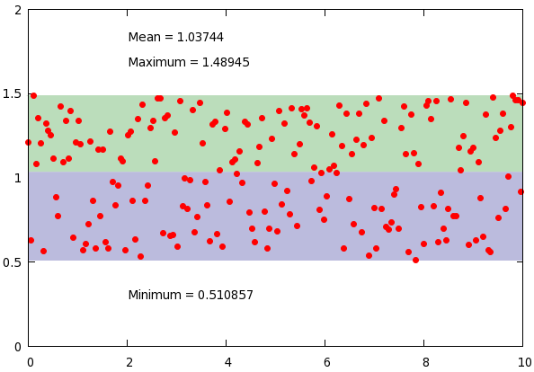
set label 1 gprintf("Minimum = %g", min_y) at 2, min_y-0.2
set label 2 gprintf("Maximum = %g", max_y) at 2, max_y+0.2
set label 3 gprintf("Mean = %g", mean_y) at 2, max_y+0.35
plot min_y with filledcurves y1=mean_y lt 1 lc rgb "#bbbbdd", \
max_y with filledcurves y1=mean_y lt 1 lc rgb "#bbddbb", \
'stats2.dat' u 1:2 w p pt 7 lt 1 ps 1
At the beginning of our script, we just produce some dummy data, and call a dummy plot. This plot does nothing but fills in the values of the minimum and maximum of the data set. Then we fit a constant function. You can convince yourself that this returns the average of the data set.
In the plotting section, we produce three labels, that tell us something about the data set, and plot the data range with shaded region. Easy enough, and in just a couple of lines, we created this figure
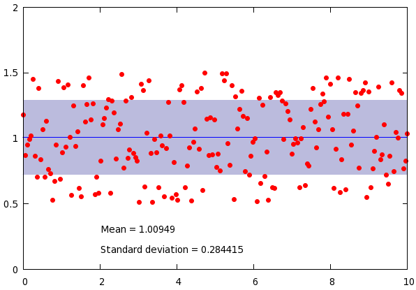
Calculating the standard deviation
Now, what should we do, if we were to calculate the standard deviation? We have already learnt how to calculate the average, so we will use that. Here is the script:
reset
set sample 200
set table 'stats2.dat'
plot [0:10] 0.5+rand(0)
unset table

set yrange [0:2]
unset key
f(x) = mean_y
fit f(x) 'stats2.dat' u 1:2 via mean_y

stddev_y = sqrt(FIT_WSSR / (FIT_NDF + 1 ))

# Plotting the range of standard deviation with a shaded background
set label 1 gprintf("Mean = %g", mean_y) at 2, min_y-0.2
set label 2 gprintf("Standard deviation = %g", stddev_y) at 2, min_y-0.35
plot mean_y-stddev_y with filledcurves y1=mean_y lt 1 lc rgb "#bbbbdd", \
mean_y+stddev_y with filledcurves y1=mean_y lt 1 lc rgb "#bbbbdd", \
mean_y w l lt 3, 'stats2.dat' u 1:2 w p pt 7 lt 1 ps 1
What we utilise here is the fact that the fit function also sets a couple of variables. One of them is the sum of the residuals, which is called FIT_WSSR, while another is the number of degrees of freedom, FIT_NDF. However, we know that the number of degrees of freedoms is one less, than the number of data points, for we fit a function with a single parameter. Therefore, if we take the square root of the sum of residuals divided by the number of degrees of freedom plus one, we get the standard deviation. The rest of the plot is trivial, and this script results in the following graph:
Removing points based on the standard deviation
Incidentally, this can also be used for removing points that are very far from the mean. The following script takes out those data that are more than one standard deviation away from the mean.
reset
set sample 200
set table 'stats2.dat'
plot [0:10] 0.5+rand(0)
unset table

set yrange [0:2]
unset key
f(x) = mean_y
fit f(x) 'stats2.dat' u 1:2 via mean_y

stddev_y = sqrt(FIT_WSSR / (FIT_NDF + 1 ))

# Removing points based on the standard deviation
set label 1 gprintf("Mean = %g", mean_y) at 2, min_y-0.15
set label 2 gprintf("Sigma = %g", stddev_y) at 2, min_y-0.3
plot mean_y w l lt 3, mean_y+stddev_y w l lt 3, mean_y-stddev_y w l lt 3, \
'stats2.dat' u 1:(abs($2-mean_y) < stddev_y ? $2 : 1/0) w p pt 7 lt 1 ps 1
with the corresponding figure
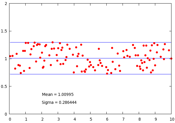
Only the last line is relevant: we use the ternary operator to decide whether we want to keep the point: if the deviation from the mean is less, than the standard deviation, we hold on to our data, otherwise, we replace it by 1/0, which is undefined, and gnuplot quietly ignores it. If you want to learn more about the working of the ternary operator, check out section on ... plotting an inequality.
Determining the position of the minimum and maximum
We have, thus, already found simple solutions for three of the problems addressed in the patch. What about the third one, adding arrows to the plot at the position of the minimum or maximum, say. We can do that, too. Here is the script:
reset
set sample 50
set table 'stats1.dat'
plot [0:10] 0.5+rand(0)
unset table

set yrange [0:2]
unset key
plot 'stats1.dat' u 1:2
min_y = GPVAL_DATA_Y_MIN
max_y = GPVAL_DATA_Y_MAX

plot 'stats1.dat' u ($2 == min_y ? $2 : 1/0):1
min_pos_x = GPVAL_DATA_Y_MIN
plot 'stats1.dat' u ($2 == max_y ? $2 : 1/0):1
max_pos_x = GPVAL_DATA_Y_MAX

# Automatically adding an arrow at a position that depends on the min/max
set arrow 1 from min_pos_x, min_y-0.2 to min_pos_x, min_y-0.02 lw 0.5
set arrow 2 from max_pos_x, max_y+0.2 to max_pos_x, max_y+0.02 lw 0.5
set label 1 'Minimum' at min_pos_x, min_y-0.3 centre
set label 2 'Maximum' at max_pos_x, max_y+0.3 centre
plot 'stats1.dat' u 1:2 w p pt 6
First, we retrieve the values of the minimum and the maximum by using a dummy plot. Having done that, we retrieve the positions of the minimum and maximum, by calling a dummy plot on the columns
plot 'stats1.dat' u ($2 == min_y ? $2 : 1/0):1
What this line does is substitute min_y, when the second column (whose minimum we extracted before) is equal to the minimum, and an undefined value, 1/0, otherwise. The minimum of this plot is nothing, but the x position of the first minimum. Likewise, had we assigned
min_pos_x = GPVAL_DATA_Y_MAX
that would have given the position of the last minimum of the data file. Obviously, these distinctions make sense only, if there are more than one minimum or maximum. Knowing the x and y positions of the minimum and maximum, we can easily set the arrows. We, thus, have the following figure
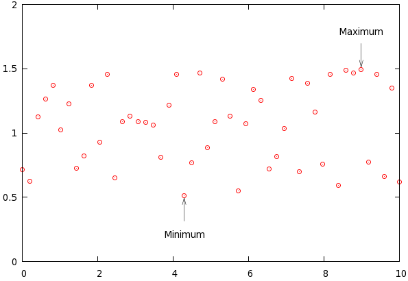
Adding labels showing the value should not be a problem now, we only have to follow the recipe outlined in the first plot.
by Zoltán Vörös © 2009