Variable grid
Adding a non-uniform grid to a plot
Useful as it is, sometimes the standard grid is not the best way to guide the eye when reading off values in a graph. Today I would like to discuss a couple of other options, none of them standard in gnuplot. Fortunately, we haven't got to leave the realm of gnuplot, everything can be done without any external scripts. To make things even more appealing, the solution requires only a couple of lines of code.
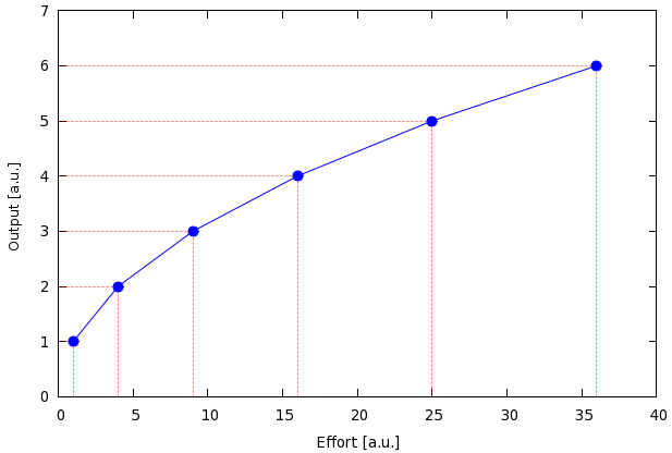
Our first attempt will be to "project" the values of a curve to the two axes, as in this figure
The data file, helpergrid.dat, contains only a couple of lines,
1 1
4 2
9 3
16 4
25 5
36 6
and the script reads as follows
reset
unset key
set xrange [0:40]
set yrange [0:7]
set xlabel 'Effort [a.u.]'
set ylabel 'Output [a.u.]'
p 'helpergrid.dat' u 1:2:(0):1 w xerror ps 0 lt 0 lw 0.5 lc rgb "#ff0000", \
'' u 1:2 w i lt 0 lw 0.5 lc rgb "#ff0000", \
'' u 1:2 w lp pt 7 ps 1.5
Drawing the vertical lines is easy, for there is a plotting style in gnuplot, impulse, which does just that. The horizontal ones are not that trivial, but take only one line of code: the idea is that we trick gnuplot into drawing the horizontal lines by something else. In this case, this something else is the error bar, in particular, the xerror bar. This is what happens in the first plotting line, after we set up the figure. The first plot calls our data file, and draws the errors that span from x=0 to x=x_data. We also specify the line type, 0, which will be dashed, the line width, and the line colour. The second plot draws the vertical lines, plotting our data with impulses. Again, we specify the line type, width, and colour, so that it conforms with the previous one. This is necessary, because, when left alone, gnuplot assigns a new line type to each new plot. Finally, we plot the data. This was simple.
I should add here that we can draw a "full" grid based on the data values. If we replace the plotting command by
p 'helpergrid.dat' u (40):2:(0):(40) w xerror ps 0 lt 0 lw 0.5 lc rgb "#ff0000", \
'' u 1:(7) w i lt 0 lw 0.5 lc rgb "#ff0000", \
'' u 1:2 w lp pt 7 ps 1.5
then the horizontal lines will be drawn between 0 and 40, while the vertical ones between 0 and 7. Now, it might happen that you don't know the xrange and yrange, in which case you can use the variables GPVAL_X_MIN, GPVAL_X_MAX, GPVAL_Y_MIN, GPVAL_Y_MAX to specify the plot. Of course, we have to call a dummy plot beforehand. We have discussed this a couple of times. If in doubt, look up the section on how to plot a martix with bars
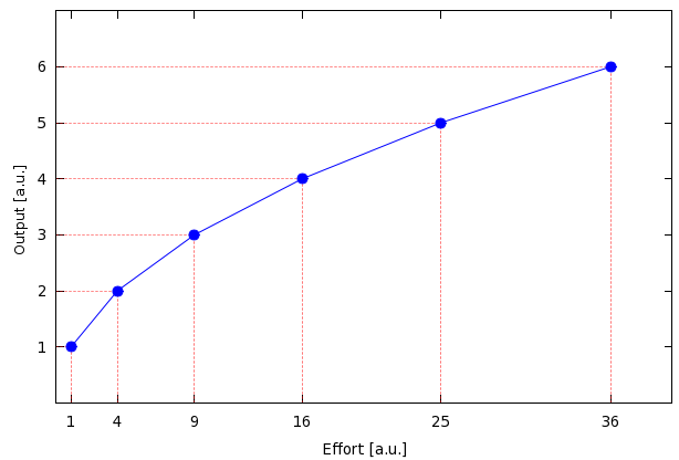
Well, we have cleared the first barrier, but what if we wanted to place the numbers where the data points are? This is quite simple: we only have to plot the file twice more, this time with xticlabel and yticlabel. So, here is our script
reset
unset key
set xrange [0:40]; set yrange [0:7]
set xlabel 'Effort [a.u.]'
set ylabel 'Output [a.u.]'
p 'helpergrid.dat' u 1:2:(0):1 w xerror ps 0 lt 0 lw 0.5 lc rgb "#ff0000", \
'' u 1:2 w i lt 0 lw 0.5 lc rgb "#ff0000", \
'' u 1:2 w lp pt 7 ps 1.5, \
'' u 1:(0):xticlabel(1) w p ps 0, '' u (0):2:yticlabel(2) w p ps 0
and here is our figure
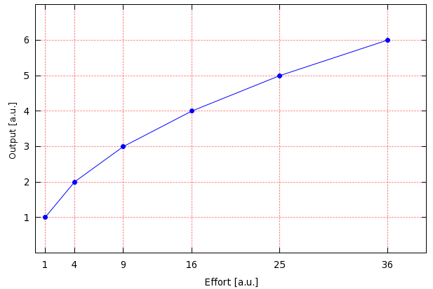
Note that in this case, if you want to produce a full grid (wall-to-wall, floor-to-ceiling), we can just set the grid, and forget about the error bars. The script for that case would be
reset
unset key
set xrange [0:40]; set yrange [0:7]
set xlabel 'Effort [a.u.]'
set ylabel 'Output [a.u.]'
set grid lt 0 lw 0.5 lc rgb "#ff0000"
p 'helpergrid.dat' u 1:2 w lp lt 3 pt 7 ps 1.5, \
'' u 1:(0):xticlabel(1) w p ps 0, '' u (0):2:yticlabel(2) w p ps 0
and this would result in this figure.
by Zoltán Vörös © 2009