Graph backgrounds
Sometimes one would like to have a graph whose background is not so monotonic. This is especially useful in presentations. I would like to discuss how we can achieve this. Especially, that I will use this quite extensively later in 3D graphs, where it really makes a difference. We will use multiplot, and plot the background on plots different to the main plot. First, here is the figure, that we have
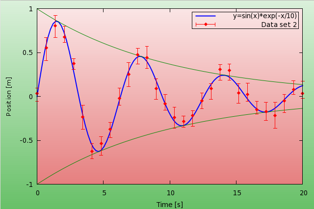
and here is the code that produced it
reset
f(x) = exp(-x/10.0)*sin(x)
g(x) = exp(-x/10.0)
h(x) = -exp(-x/10.0)
set sample 30
set table 'test.dat'
plot [0:20] f(x)+(rand(0)-0.5)*0.2
unset table

set sample 100

set multiplot
set palette model RGB functions 0.4+gray/1.667, 0.75+gray/4.0, 0.4+gray/1.667
set pm3d map
set isosample 100,100
set yrange [-1:1]
unset colorbox
unset border
unset xtics
unset ytics
set size 1.5,1.6
set origin -.25,-.3
splot y t ''

set palette model RGB functions 0.9+gray/10.0, 0.5+gray/2.0, 0.5+gray/2.0
set size 1.208, 1.295
set origin -0.065,-0.125
splot [0:20] y  t ''

set size 1,1
set origin 0,0
set xtics
set ytics
set xlabel 'Time [s]'
set ylabel 'Position [m]'
set border 1+2+4+8
set key reverse box

plot [0:20] f(x) w l lt 3 lw 2 t 'y=sin(x)*exp(-x/10) ', \
g(x) w l lt rgb "#008800" t '', h(x) w l lt rgb "#008800" t '', \
'test.dat' u 1:2:($2-rand(0)*0.1-0.05):($2+rand(0)*0.1+0.05) w errorb pt 13 lt 1 t 'Data set 2 '

unset multiplot
Now, let us see what is happening here! The first couple of lines are there just to produce some data (in this case, a damped oscillation with some random noise). The interesting part begins with set multiplot: we define a palette, which will run between some shade of green and white. This will be our background for the whole image. It will have a gradient, because we plot the function y, so as we go towards the top, the colour becomes whiter and whiter. In order to cover the whole canvas, we have to play with the size a bit, but this should be more or less straightforward.
In the second plot, the only thing that really is different is the colour palette, which, this time, is from some shade of red to white. Again, you might have to set the size of the plot by hand, and this might also depend on the actual terminal that you are using.
In the last part, we set the labels and the border (if you cast a glance at the code, you'll notice that these were switched off at the beginning), and plot our functions and data. Since I wanted to show errorbars, I generated artificial errors with the rand(0) function. If you have a real data set that you want to plot, this should be much simpler. You can skip the first 7 lines, and just use the columns in your data file to show the errors.
If you do not want to tamper with the size of the rectangles, there might be a short-cut: in gnuplot 4.2 and onward, you can plot maps not only with pm3d, but with plot image. The advantage of this method is that the plot will be just as large as the plotting area on your figure. The downside is that this works for data files only, and not with functions. But this is not a real problem, for we can plot our data to a file, and then plot the file. So, in this spirit, the script above would take on the following form
...
set table 'bg.dat'
splot [0:20] y  t ''
unset table
set palette model RGB functions 0.9+gray/10.0, 0.5+gray/2.0, 0.5+gray/2.0
...
plot [0:20] 'bg.dat' w image, f(x) w l lt 3 lw 2 t 'y=sin(x)*exp(-x/10)'
...
If the gradient is needed only on the actual graph, and not the whole canvas, this method also would spare you of the multiplot.
by Zoltán Vörös © 2009